Text
The Text element allows you to display static or dynamic text content within your project. It supports flexible data binding, making it useful for both labels and dynamic data displays.
Adding a Text Element
There are two ways to add a Text element:
-
From the
Page Containerssection:- Open
Containersand clickAdd Element. - The
New Elementwindow appears, where you can assign aNameand select the elementType. - Click the dropdown menu for
Typeand selectText.
- Open
-
From the
Editorpage:- Right-click anywhere on the page.
- Select
Add Elementfrom the menu. - The same
New Elementwindow will appear, allowing you to assign the elementNameand selectTextas the type.
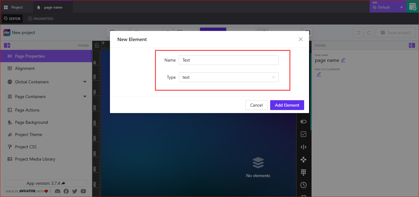
After adding, you can configure the element’s properties as needed.
Text Friendly Name
Click the edit icon (pencil) to make Text Friendly Name editable. Assign a name that helps identify the element easily within your project.
Data Source
Text Data Source
Choose whether the text is Static or Dynamic.
Staticdisplays fixed text content.Dynamicopens theSelect Data Source to Work Withwindow with a dropdown menu to pick an available data source.
Size
Set Width and Height values for the text element.
- Units can be in
PixelsorPercentage. - Both width and height allow
Assign Dynamic Value. Selecting the dynamic value icon{-}opens thePick Dynamic Valuewindow, where you can selectVariables,Parameters, orStateentries.
Element Constraints
Element Constraints control positioning anchors and stacking order.
Constraints X Axis
Defines the horizontal anchor point of the element.
- Example:
Left - Accepts dynamic values and expressions.
Constraints Y Axis
Defines the vertical anchor point of the element.
- Example:
Top - Accepts dynamic values and expressions.
Z Index
Controls the stacking order relative to other elements.
- Higher values render above lower ones
- Supports dynamic values and expressions
Dimensions
Dimensions group sizing-related behavior and determine how the Text element occupies space.
- Width and Height units:
pxor% - Each field supports
Assign Dynamic Valueand post-processing functions - Works together with layout constraints to produce the final on-page size
Mode Selector by Index or Name
Mode Selector by Index or Name lets you switch between available text modes using either an index or a mode name.
- You can
Assign Dynamic Value, represented by the{-}icon inside curly brackets. - You can also
Assign Post-Processing Function. Selecting this opens theSelect Post Processing Functiondropdown menu, where you can choose the desired function.
Available Text Modes
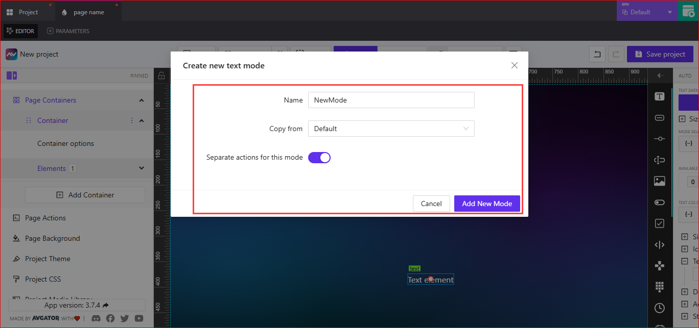
By default, there is only the Default mode. You can add new modes by selecting the + icon. This opens the Create New Text Mode window, where you can:
- Set a
Namefor the new mode. - Choose to
Copy fromtheDefaultmode. - Toggle
Separate actions for this modeif you want distinct actions for the new mode. - Click
Add New Modeto create it.
Text CSS Classname
The Text CSS Classname field is editable. You can enter a custom CSS class name to apply additional styling to the text element.
- You can
Assign Dynamic Valueto dynamically change the class name. - You can also
Assign Post-Processing Function, which opens theSelect Post Processing Functiondropdown menu to choose a function for modifying the value before it is applied.
Appearance
Appearance in the panel maps to the styling controls documented below in the Design section. It covers color, background, font, border, shadow, and reflection.
Sizing
Sizing defines the text size for the element.
- You can
Assign Dynamic Value, which opens thePick Dynamic Valuewindow to selectVariables,Parameters, orStateentries, then save the changes. - Text size units can be set to:
px(pixels)vh(viewport height)bw(baseline width)
Icon
Icon allows you to attach an image icon to the text element for additional visual context.
Use Image as Icon
Toggle Use Image as Icon to enable image-based icons for the text element.
When enabled, you can choose between two options: Library or URL.
Library
When Dynamic Pick from Library is turned on, you can manually select an image from the existing library using Pick Image.
After selecting an image, you can configure:
Icon Size- You can
Assign Dynamic Value, which opens thePick Dynamic Valuewindow to selectVariables,Parameters, orStateentries. - Units available:
px,vh, orvw. - You can also manually enter a numeric value for the size.
- You can
Icon Position- Positions available:
Left,Top,Right,Bottom. - You can also
Assign Dynamic Valueto set the position dynamically.
- Positions available:
Inner Content Gap- Sets the space between the icon and text.
- Supports units
px,vh, andvw. - You can also
Assign Dynamic Valuefor this setting.
When Dynamic Pick from Library is turned on, you can set Pass Image ID from Library.
- You can
Assign Dynamic Value, which opens thePick Dynamic Valuewindow to selectVariables,Parameters, orStateentries. - You can manually enter the library image ID into the field.
- You can also
Assign Post-Processing Function, which opens theSelect Post Processing Functiondropdown menu to modify the value before it is applied.
Other settings remain available and work the same for both:
Icon Size- Supports
Assign Dynamic Value, unitspx,vh,vw, and manual numeric entry.
- Supports
Icon Position- Positions:
Left,Top,Right,Bottom. - Supports
Assign Dynamic Value.
- Positions:
Inner Content Gap- Controls spacing between the icon and text.
- Supports
Assign Dynamic Valueand unitspx,vh,vw.
URL
When you select URL, you can use an external image as an icon.
- You can
Assign Dynamic Value, which opens thePick Dynamic Valuewindow to selectVariables,Parameters, orStateentries. - Enter the external image URL in the
External Image URLfield.
After providing the URL, you can configure:
Icon SizesupportsAssign Dynamic Value, unitspx,vh,vw, and manual numeric entry.Icon PositionallowsLeft,Top,Right,Bottom.Inner Content Gapcontrols spacing between the icon and text. This supportsAssign Dynamic Valueand unitspx,vh,vw.
Default Icon (when Use Image as Icon is off)
When Use Image as Icon is turned off, you can attach a regular icon from available icon libraries.
-
Click
Filter Icon Libraryto choose which icon library to use. Available libraries include examples likeFontawesome,Material Design,Hero, andFlat. -
After selecting a library, you can choose an icon using the
Select Iconoption.Select Iconprovides two modes:Manual– Manually pick an icon from the selected library.- Choose from a dropdown list of available icons.
- Alternatively, click the
Icon Library Explorer(search icon) to open a full icon browser for easier selection.
Dynamic– Allows dynamic selection of icons by assigning values at runtime.
-
Configure
Inner Content Gapto controls spacing between the icon and text. This also supportsAssign Dynamic Valueand unitspx,vh, andvw.
Note: Inner Content Gap is equivalent to the Icon‑Text Gap mentioned in other panels.
Text Content
Selecting Text Content opens the Edit Text window, which allows you to define and style the text displayed by the element.
Edit Text Window
The Edit Text window provides a text editor with the following options:
-
Variable Insert Buttons
A,D,S,NUM,BOOL,STR,ST, andPARAMETERbuttons insert variables, parameters, or state references into the text.
-
Basic Text Formatting
B(bold),I(italic),S(strikethrough),U(underline), andX₂/X²for subscript/superscript.
-
Alignment and Styles
- Text alignment options: left, center, right, justify.
A↑andA↓to adjust text size.Tmenu for headings or block formatting.
-
Lists
- Bullet and numbered lists.
-
Additional Options
Sourcetoggles between visual and source code editing.- Undo/redo buttons are available for quick changes.
After editing, click Save to apply changes or Cancel to discard them.
Design
The Design section allows you to customize the visual styling of the text element.
Font Family
Font Family lets you choose the typeface used for the text element.
Text Transform
Text Transform controls how the text is capitalized. Available options are None, Uppercase and Capitalize.
There is also a toggle for Allow Text Wrap.
- When enabled, text will wrap within the container.
- When disabled, text remains on a single line.
Text Color
Text Color allows you to set the color of the text.
- You can
Assign Dynamic Value, which opens thePick Dynamic Valuewindow to selectVariables,Parameters, orStateentries. - You can manually type in the color value or use the color selector.
Icon Color
Icon Color sets the color of the icon (if an icon is used).
- You can
Assign Dynamic Value. - You can type in the color value or select from the color picker.
Background Color
Background Color defines the background behind the text element.
- You can
Assign Dynamic Value. - You can manually enter a color value or use the color selector.
Border
The Border section controls border styling for the text element.
Default
When Default is selected, the text element uses its default border settings.
Override
When Override is selected, you can customize the border:
- Border Width
- Set values for
Top,Right,Bottom, andLeft. - You can manually enter numeric values or increase/decrease using controls.
- Set values for
- Border Type
- Choose from
Solid,Dashed, orDotted.
- Choose from
- Border Color
- Use the color picker or manually enter a color value.
- Border Radius
- Define corner rounding in pixels.
- Supports individual values for
Top Left,Top Right,Bottom Left, andBottom Right.
Shadow
The Shadow option adds a shadow effect behind the text element.
- None – Disables the shadow.
- Enabled – Allows you to customize:
- X Offset and Y Offset
- You can
Assign Dynamic Valueor manually enter offset values (in pixels).
- You can
- Blur
- You can
Assign Dynamic Valueor set a blur value (in pixels).
- You can
- Spread
- You can
Assign Dynamic Valueor enter a spread value (in pixels).
- You can
- Color
- By default, the shadow color is black.
- You can
Assign Dynamic Value, type a color value, or use the color selector.
- Inner Shadow
- Optionally enable or disable inner shadow.
- X Offset and Y Offset
Reflect
The Reflect option adds a reflection effect to the text element.
- None – No reflection is applied.
- Enabled – Allows you to configure:
- Alignment
- Dropdown options:
Bottom(default),Top,Left,Right.
- Dropdown options:
- Offset
- Adjusts the distance of the reflection.
- Start Opacity
- Defines the opacity at the start of the reflection.
- End Opacity
- Defines the opacity at the end of the reflection.
- Alignment
Actions (OUT)
Actions define interactive behavior for the Text element.
Add New Action
Selecting Add New Action opens the Create New Action for Text modal.
Create New Action for Text
Configure how the element responds to interaction (tap, click, etc.).
General Settings
- Name: Action label for identification
- Behaviour: How the action is triggered (e.g.,
Tap) - Execution Delay: Delay before execution in milliseconds
Action Categories
Available categories include:
- Crestron
- Routing
- Variables
- Parameters
- Overlays
- Functions
- HTTP Web Requests
- Web Sockets
- MQTT
- Audio
Crestron Action Example
- Type: Crestron action type (e.g.,
Push Digital) - Signal Name: The target signal to trigger (required)
- Push Data:
True,False,Pulse,Momentary, orToggle - Pulse Delay: Pulse duration in milliseconds
Click Create action to save and attach it to the Text element.
State (IN)
The State section controls visibility, orientation behavior, and interaction signals for the text element.
Value
Configure how the Text element’s live value is sourced and handled.
Tabs:
- Direct Value: Provide the value directly or via a dynamic expression. Use this for local defaults or programmatic updates.
- Crestron FB: Bind the value to a Crestron feedback signal so the element reflects controller feedback.
Field: Value
- Click
{-}to assign Variables/Parameters/State; optionally usefxfor transformation.
Field: Checked Value
- Applies when the Text element is configured to reflect a boolean state (e.g., on/off indicator). Hidden when not applicable.
Toggle: Auto focus on load
- When enabled, focuses the element automatically when the page loads.
Orientation Visibility
Orientation Visibility determines when the text element is visible based on device orientation.
Available options:
BothPortrait Only VisibleLandscape Only Visible
Visibility Dynamic Value
Visibility Dynamic Value controls whether the element is shown or hidden dynamically.
- You can
Assign Dynamic Value, which opens thePick Dynamic Valuewindow to selectVariables,Parameters, orStateentries. - You can also manually enter the visibility dynamic value in the field.
Visibility Signal
Visibility Signal allows you to toggle the element’s visibility using a signal.
- You can
Assign Dynamic Valueor enter the visibility signal value directly. - Includes a toggle for
Reserve Space When Hiddento keep or release layout space when the element is hidden.
Reserve Space While Hidden
Preserves layout space when the element is hidden. Toggle on to avoid layout shifts.
Disabled Signal
Disabled Signal determines when the element is disabled.
- You can
Assign Dynamic Valueor enter the disabled signal value directly in the field. - Supports feedback-driven dynamic values and expressions.