Dpad
The Dpad element adds a directional pad to the canvas, typically used for navigation or directional control in UI layouts. It includes up, down, left, right, and center inputs, and can be configured to trigger different types of actions depending on your use case.
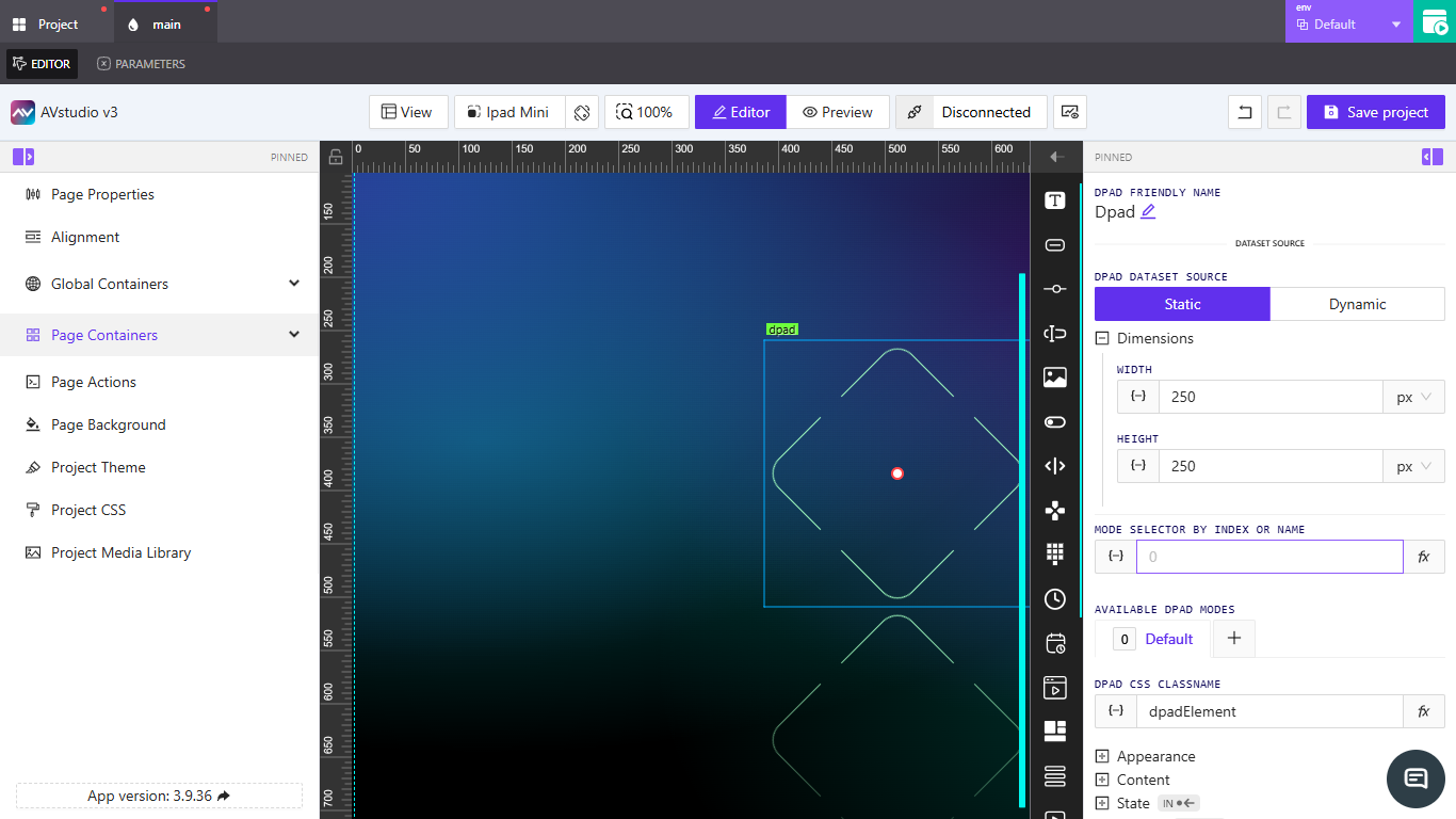
Adding a Dpad Element
To add a Dpad element to a page, follow the steps in How to Add an Element. Once added, select the element to configure its settings in the right-side panel.
Dpad Friendly Name
Click the pencil icon next to the default label to rename the element. This friendly name appears in the editor and helps distinguish the element from others on the canvas.
Dpad Dataset Source
Use this option to choose how the dpad will receive or reference its data.
Static: This mode is used when the dpad’s data source is fixed and not expected to change dynamically. Use this when you want to manually assign values to each direction (e.g., Up = 1, Down = 2, etc.).Dynamic: This mode is used when the values need to come from a live or computed source—such as a variable, parameter, or external signal. SelectingDynamicopens theSelect Data Source to Work Withmodal, where you can choose the source from a dropdown.
Choose the mode that aligns best with how your control system or navigation logic is expected to behave.
Dimensions
This section allows you to define the dpad’s width and height. You can input fixed values or use expressions by clicking the fx button. The unit of measurement can be selected from the dropdown beside each input field (e.g., px, %, etc.).
Width: Sets the horizontal size of the dpad.Height: Sets the vertical size of the dpad.
Mode Selector by Index or Name
This setting lets you control which dpad mode is currently active. You can provide a numeric index or a string name, depending on how your dpad modes are configured. The field supports two configuration options:
Assign dynamic value{−}: Opens thePick dynamic valuemodal where you can choose a source under theVariablesorParametertabs. Use this when the active mode should be driven by runtime data or state.Assign post-processing functionfx: Opens theSelect post-processing functionmenu. Choose a function to transform the assigned value (index or name) before it is applied—useful for formatting, mapping, or conditional logic.
Available Dpad Modes
This list contains the modes that the dpad can switch between. By default, only one mode labeled Default is created. You can add more modes by clicking the + button. These modes allow you to define different dpad layouts or behavior presets that can be toggled at runtime.
Create New Dpad Mode
Clicking the + opens the Create new dpad mode modal, where you configure:
Name: The display name for the new mode (e.g.,NewMode).Copy from: Select a base mode to copy settings from (default isDefault).Separate actions for this mode: Toggle ON to attach a distinct set of Actions to this mode (instead of sharing the default mode’s actions).
Use Cancel to exit without changes, or select Add New Mode to create and add the mode to the list.
Dpad CSS Classname
This field is used to assign a custom CSS class to the dpad element. You can either manually input a classname or click the fx button to dynamically assign one. This is useful when applying specific styles or targeting the dpad through custom project CSS.
The default classname is dpadElement.
The field supports two configuration options:
Assign dynamic value{−}: Opens thePick dynamic valuemodal where you can choose a source under theVariablesorParametertabs. Use this to drive the classname from runtime state.Assign post-processing functionfx: Opens theSelect post-processing functionmenu to transform the assigned value before it is applied—helpful for mapping or conditional styling.
Appearance
Color & Background
Configure the Dpad’s colors:
Default Color: The base color of the Dpad. Use the color picker or type a color name (e.g.,red) or hex value (e.g.,#FF0000).Pressed Color: The color shown while the Dpad is pressed. Use the color picker or type a color name or hex value.Text Color: The color of any labels/text rendered with the Dpad. Use the color picker or type a color name or hex value. This supportsAssign dynamic value{−}to drive the color fromVariablesorParameter.
Font
Control the typography of labels rendered by the Dpad:
Font Family: Choose the typeface for Dpad text. TheDefaultoption uses the project’s default font family. Use the drop-down to select another available font family.Font Size: Set how large the text appears. You canAssign dynamic value{−}to drive the size fromVariablesorParameter, or enter a direct numeric value and choose a unit (px,em,vh,vw).Text Transform: Adjust the casing of the text. Options includeNone,Uppercase,Lowercase, orCapitalized.
Border
Define the Dpad’s border style:
Corners Radius: Control the roundness of the Dpad’s corners. You canAssign dynamic value{−}(opens thePick dynamic valuemodal withVariablesandParametertabs), or enter a direct numeric value; the unit ispx.Thickness: Set the border thickness. You canAssign dynamic value{−}(opens thePick dynamic valuemodal withVariablesandParametertabs), or enter a direct numeric value; the unit ispx.
Reflection
Control the element’s reflection using the Reflect toggle:
None: Disables the reflection; no additional settings are required.Enabled: Shows the following controls:Align: Choose the reflection placement —Top,Bottom,Left, orRight(default isBottom).Offset: Set the spacing between the element and its reflection. Enter a numeric value directly or use the up/down arrows to adjust.Start Opacity: Adjust the starting opacity of the reflection with a slider; you can also type a value or use the arrows to increase/decrease.End Opacity: Adjust the ending opacity with a slider; you can also type a value or use the arrows to increase/decrease.
Content
Manage the central button visibility and button labels.
Hide central button: Toggle ON to hide the center button from the Dpad.Buttons Text: Set labels forCenter,Top,Right,Left, andBottom. Each field supportsAssign dynamic value{−}(opens thePick dynamic valuemodal withVariablesandParametertabs) or direct text entry in the input.
Controls
Assign signal values to each directional and center button. These values can be used to trigger logic or actions when a button is pressed.
Center Signal: The signal value associated with the center button.Top Signal: The signal value for the top directional input.Right Signal: The signal value for the right directional input.Left Signal: The signal value for the left directional input.Bottom Signal: The signal value for the bottom directional input.
Each field accepts either a direct value or Assign dynamic value {−} to bind via the Pick dynamic value modal.
State
Configure when the Dpad is visible and whether it can be interacted with.
Visibility
Orientation Visibility: ChooseBoth,Portrait Only Visible, orLandscape Only Visible.- Mode: Select between
Direct ValueandCrestron FB.
When Direct Value is selected:
Visibility Dynamic Value:Assign dynamic value{−}to open thePick dynamic valuemodal (tabs:Variables,Parameter), or type a direct value/expression to control show/hide.Reserve space while hidden: Toggle ON/OFF to keep layout space even when the element is hidden.
When Crestron FB is selected:
Visibility Signal: Enter a signal, or useAssign dynamic value{−}to open thePick dynamic valuemodal and bind a signal dynamically.Reserve space while hidden: Toggle ON/OFF to keep layout space even when the element is hidden.
Disabled Signal
Disabled Signal: Enter a value to disable the element, or useAssign dynamic value{−}to open thePick dynamic valuemodal (tabs:Variables,Parameter).
Actions
Define what happens when the Dpad is interacted with.
- Click
Add new actionto open theCreate new action for Dpadmodal. - Core fields:
Name: The action’s display name.Behaviour: How the action should trigger (e.g.,Tap).Execution Delay: Optional delay before the action runs (inms).Threshold: Sensitivity/threshold value used for Dpad interactions.
- Integration tabs:
Crestron,Routing,Variables,Parameters,Overlays,Functions,HTTP Web Requests,Web Sockets,MQTT,Audio. Each tab exposes target-specific settings you configure as needed. - Use
Create actionto save orCancelto discard.