Autonomic Media Player (Premium)
The Autonomic Media Player premium widget provides a rich player UI tightly integrated with Autonomic Mirage systems. It supports dynamic modes, customizable appearance, and connector-driven data.
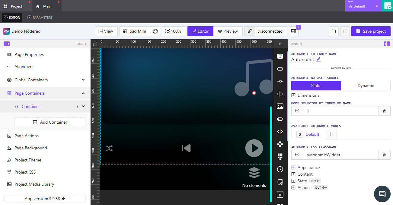
Adding an Autonomic Media Player
Follow How to Add an Element. In Type, select Autonomic Media Player, then configure options in the right-side panel.
Autonomic Friendly Name
The UI shows Autonomic Friendly Name. Click the pencil icon to rename the element. This name appears throughout the editor for easier identification.
Autonomic Dataset Source
Choose how the element receives Autonomic data:
Static: Uses default values.Dynamic: Opens theSelect Data Source to Work Withmodal to bindVariables/Parameter.
Dimensions
Define width and height. Each field supports dynamic or direct input:
Width:Assign dynamic value[-] or enter a numeric value and select a unit (pxor%).Height:Assign dynamic value[-] or enter a numeric value and select a unit (pxor%).
Mode Selector by Index or Name
Control which Autonomic mode is active using a numeric index or name.
Assign dynamic value[-]: OpensPick dynamic value(Variables,Parameter).Assign post-processing functionfx: Transform value before applying.
Available Autonomic Modes
Manage modes the widget can toggle between. A Default mode is always present.
- Click
+to openCreate New Autonomic Mode. - Fields:
Name,Copy from default,Separate actions for this mode(toggle). - Buttons:
Cancel,Add New Mode.
Autonomic CSS Classname
Assign a custom CSS class to style the widget.
Assign dynamic value[-]: OpensPick dynamic valuewithVariablesandParameter.- Enter the class name directly.
Assign post-processing functionfx: Apply a function to the final value.
Appearance
Color & Background
Configure background and label colors. Each color field supports Assign dynamic value [-], direct entry, and the color picker.
Background: Set via dynamic value, direct entry, or color picker.
Font
Typography options for labels/text within the widget.
Font Family: Dropdown;Defaultuses project theme.Font Size:Assign dynamic value[-] or enter a numeric value (px).
Padding
Control inner spacing.
Padding Control:Assign dynamic value[-] or enter a numeric value; unitpx.Show advanced padding: Toggle to specify per-side values.
Border
Choose defaults or customize:
Default: Uses theme defaults.Override: Shows controls:Border Width: Four inputs (Top, Right, Bottom, Left).Style:Solid,Dashed,Dotted.Color: Direct entry or color picker.Border Radius: Numericpxwith corner presets.
Shadow
Toggle shadow and configure:
NoneorEnabled.X Offset(px, dynamic supported),Y Offset(px, dynamic supported).Blur(px).Spread(px, dynamic supported).Color: dynamic, manual, or picker.Inset shadow: Toggle.
Reflection
Toggle reflection and configure:
NoneorEnabled.Align:Top,Bottom,Left,Right.Offset: Slider + numeric.Start Opacity(0–100),End Opacity(0–100).
Content
Configure player-specific text.
Base URL:Assign dynamic value[-] or enter a URL for Autonomic resources.Default Player Name:Assign dynamic value[-] or enter a name.Hide Player Selector: Toggle to hide/show the player selector control.
State
Configure visibility and interactivity.
Visibility
Orientation Visibility:Both,Portrait Only Visible,Landscape Only Visible.- Mode:
Direct ValueorCrestron FB.
When Direct Value is selected:
Visibility Dynamic Value:Assign dynamic value[-] or type a direct expression.Reserve space while hidden: Toggle ON/OFF.
When Crestron FB is selected:
Visibility Signal: Enter a signal or useAssign dynamic value[-].Reserve space while hidden: Toggle ON/OFF.
Disabled Signal
Disabled Signal: Enter a value or useAssign dynamic value[-] to disable the element.
Actions
Define what happens when the widget is interacted with.
- Click
Add new actionto open theCreate new action for Autonomic Media Playermodal. - Core fields:
Name,Behaviour,Execution Delay(ms),Threshold(if shown). - Integration tabs:
Crestron,Routing,Variables,Parameters,Overlays,Functions,HTTP Web Requests,Web Sockets,MQTT,Audio. - Use
Create actionto save orCancelto discard.