State Control
The State Control element replaces Switch and provides a clear ON/OFF control for managing binary state, visibility, or feature activation.
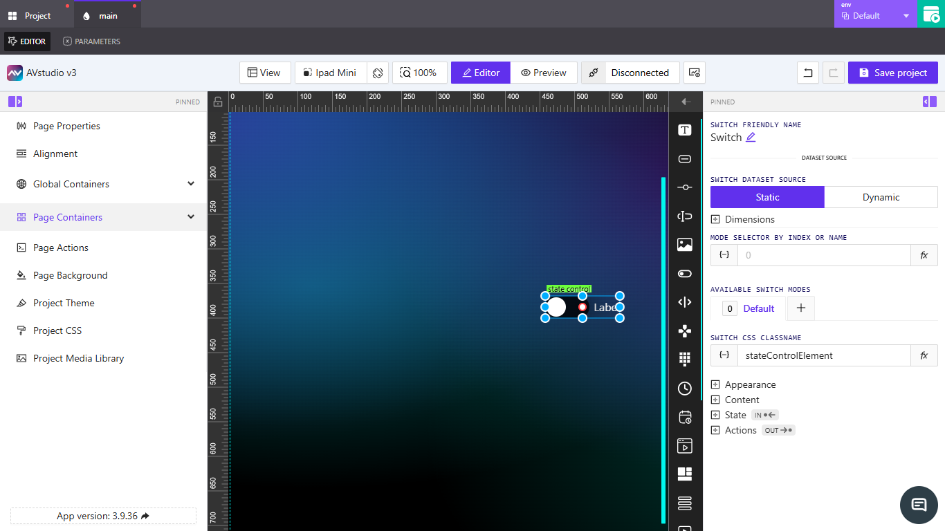
Adding a State Control Element
Follow the steps in How to Add an Element. In the Type dropdown, select State Control, then configure options in the right-side panel.
Switch Friendly Name
The UI shows Switch Friendly Name and the default name is Switch. Click the pencil icon next to the label to rename the element. This friendly name appears in the editor and helps you identify the element across the project.
Switch Dataset Source
Choose how the element receives or references its data:
Static: Provides a fixed configuration.Dynamic: Opens theSelect Data Source to Work Withmodal to choose from available sources.
Dimensions
Define the element’s width and height. Each field supports dynamic or direct input:
Width: UseAssign dynamic value{−}to bind fromVariables/Parameter, or enter a numeric value and select a unit (pxor%).Height: UseAssign dynamic value{−}to bind fromVariables/Parameter, or enter a numeric value and select a unit (pxor%).
Mode Selector by Index or Name
Control which state/mode is active using a numeric index or name.
Assign dynamic value{−}: Opens thePick dynamic valuemodal (Variables,Parameter).Assign post-processing functionfx: OpensSelect post-processing functionto transform the value before applying.
Available Switch Modes
Manage modes the element can toggle between. A Default mode is always present.
- Click
+to open theCreate New Switch Modemodal. - Fields:
Name,Copy from default, andSeparate actions for this mode(toggle). - Buttons:
Cancel,Add New Mode.
Switch CSS Class Name
Assign a custom CSS class to target the element with project styles.
Assign dynamic value{−}: Opens thePick dynamic valuemodal withVariablesandParametertabs.- Enter the class name directly in the field.
Assign post-processing functionfx: OpensSelect post-processing functionto transform the value.
Appearance
Variant
Choose the visual style for the control:
SwitchCheckboxToggle
Color & Background
Configure label and surface colors. Each color field supports Assign dynamic value {−} (opens Pick dynamic value with Variables and Parameter) and a color picker, or you can type a value directly.
Label Text Color: Set the label’s text color via dynamic value, direct entry, or color picker.UnChecked state:Off Inner Text ColorSwitch Unchecked BackgroundThumb Unchecked BackgroundEach supportsAssign dynamic value{−}and the color picker.
The Checked state provides the same set of fields and behaviors as the UnChecked state (including dynamic values and the color picker).
Size
Control the overall size and spacing between the switch and its label. Both fields support Assign dynamic value {−} and unit selection.
Switch Size: Enter a numeric value, choose unitpx, or bind a dynamic value.Switch-Label Gap: Enter a numeric value, choose unitpx, or bind a dynamic value.
Font
Configure typography for the label.
Font Family: Use the dropdown;Defaultfollows the project’s font.Font Size: UseAssign dynamic value{−}or enter a numeric value and select unitpx.Text Transform: OptionsNone,Uppercase,Lowercase,Capitalized.Allow text wrap: Toggle to allow multi-line label text when space is constrained.
Border
Choose whether to use defaults or fully customize the border.
Default: Uses the project/theme defaults; no changes required.Override: Reveals the customization controls:Border Width: Four inputs for each side (Top, Right, Bottom, Left). Enter numeric values.Style: SelectSolid,Dashed, orDotted.Color: Enter a color value or pick from the color picker.Border Radius: Enter a numeric value with unitpx. Quick corner presets are available to apply common rounding patterns.
Shadow
Choose whether a shadow is applied.
None: No shadow.Enabled: Shows the following controls:X Offset:Assign dynamic value{−}or enter a numeric value; unitpx.Y Offset:Assign dynamic value{−}or enter a numeric value; unitpx.Blur: Enter a numeric value; unitpx.Spread:Assign dynamic value{−}or enter a numeric value; unitpx.Color:Assign dynamic value{−}, type a color value, or use the color picker.Inset shadow: Toggle to switch between drop shadow and inset shadow.
Reflection
Choose whether a reflection is applied.
None: No reflection.Enabled: Shows the following controls:Align: Dropdown withTop,Bottom,Left, orRight.Offset: Slider and numeric input to control the distance.Start Opacity: Slider and numeric input (0–100).End Opacity: Slider and numeric input (0–100).
Content
Configure the visible text and its ordering.
Label Text: Enter the label shown next to the control.Content Order: Choosenormalorreverseto switch the order of the label and the control.On Inner Text: UseAssign dynamic value{−}or type the text displayed when the control is ON.Off Inner Text: UseAssign dynamic value{−}or type the text displayed when the control is OFF.
State
Configure visibility and interactivity.
Visibility
Orientation Visibility:Both,Portrait Only Visible,Landscape Only Visible.- Mode:
Direct ValueorCrestron FB.
When Direct Value is selected:
Visibility Dynamic Value:Assign dynamic value{−}or type a direct expression.Reserve space while hidden: Toggle ON/OFF.
When Crestron FB is selected:
Visibility Signal: Enter a signal or useAssign dynamic value{−}.Reserve space while hidden: Toggle ON/OFF.
Disabled Signal
Disabled Signal: Enter a value or useAssign dynamic value{−}to disable the element.
Actions
Define what happens when the State Control is interacted with.
Note: Actions setup mirrors Dpad exactly. See Dpad → Actions for a full walkthrough of tabs and parameters.
- Click
Add new actionto open theCreate new action for State Controlmodal. - Core fields:
Name,Behaviour,Execution Delay(ms),Threshold(if shown). - Integration tabs:
Crestron,Routing,Variables,Parameters,Overlays,Functions,HTTP Web Requests,Web Sockets,MQTT,Audio. - Use
Create actionto save orCancelto discard.