Project Theme
The Project Theme section allows you to define global design settings that apply across your entire project. These include a shared background and universal styling variables like primary colors, text colors, and border radius. Setting your theme properly ensures consistency, simplifies styling, and makes it easier to update your project visually in the future.
This section is divided into two areas:
- Global Project Background
- Theme Variables
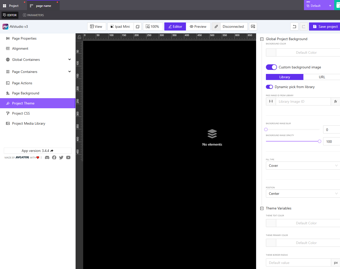
Global Project Background
The global project background is the default background style applied to all pages unless they specify their own background override.
Background Color
You can apply a solid background color using either:
- A color picker
- A manually typed value (e.g.
#000000,rgba(255,255,255,0.5))
This sets a base color for all pages.
Custom Background Image
Toggle Custom background image to enable background image options. You can choose your image source from:
1. Media Library
- Click
Pick imageto open and select an image from your media library - Toggle
Dynamic pick from libraryif you'd like the background image to change dynamically - When toggled, you will be prompted to provide a
Library Image ID, which can be:- A manually typed value
- Or a dynamic value via variable, parameter, or state entry
You also have the option to assign a post-processing function. Click the fx icon to select a function that can manipulate the image—such as resizing or transforming it before rendering.
2. URL
Select the URL tab to use an external image source. Enter the external image link directly or assign a dynamic value using variables or parameters.
Background Image Styling
Once an image is selected, you have full control over how it's displayed:
- Background Image Blur: A slider to soften or blur the background image
- Background Image Opacity: Adjust how visible the image is, from 0 (fully transparent) to 100 (fully visible)
- Fill Type:
Cover(default): Scales the image to cover the entire containerContain: Ensures the image fits inside the container without croppingFill: Stretches the image to match both height and widthCustom Size: Lets you define exactwidthandheight
If you choose Custom Size, you can:
-
Input fixed values or assign dynamic values
-
Choose between
%andpxunits -
Adjust width and height independently
-
Position: Align the image based on your layout. Options include:
Center(default)TopBottomLeftRight
Use Custom Size + Position for advanced layouts where you want to control how and where the background image appears, especially on large screens or asymmetric designs.
Theme Variables
Theme variables allow you to define project-wide styling tokens. These settings are used throughout components and containers that reference theme values.
Theme Text Color
Set the default color for text in your project. You can:
- Select a color from the color picker
- Or type in a HEX, RGB, or RGBA value
Use this for general text and labels that don’t have local overrides.
Theme Primary Color
This defines the project’s primary brand color. It is commonly used for:
- Buttons
- Highlights
- Icons
- Accent elements
Choose a color using the picker or enter a value manually.
Theme Border Radius
This setting defines the default border radius for elements across the project.
- Enter a numeric value (e.g.,
4,12,16) - The value is measured in pixels (
px)
Setting this globally helps maintain consistent UI rounding throughout your project, especially if you're using cards, buttons, and containers that should visually align.
Summary
The Project Theme section lets you control the foundational look and feel of your entire AVstudio project. These settings ensure visual consistency, reduce design duplication, and enable rapid updates across your layout.
Use the:
- Global Project Background to set a shared page background (color or image)
- Theme Variables to define primary colors and UI rules for border radius and text color
Use dynamic values and post-processing functions in the background image settings to create responsive, context-aware themes that can adapt across pages or based on user states.