Page Background
The Page Background section allows you to customize the visual background of the page. You can use a solid color or set a background image from either your media library or an external URL. Additional options let you control blur, opacity, and image positioning.
Background Color
By default, the background is set using a background color.
- You can type in a specific value (e.g.,
#FFFFFF,rgba(0,0,0,0.5)) - Or use the color picker to visually choose the background color
This is ideal for simple, clean layouts that don’t require background images.
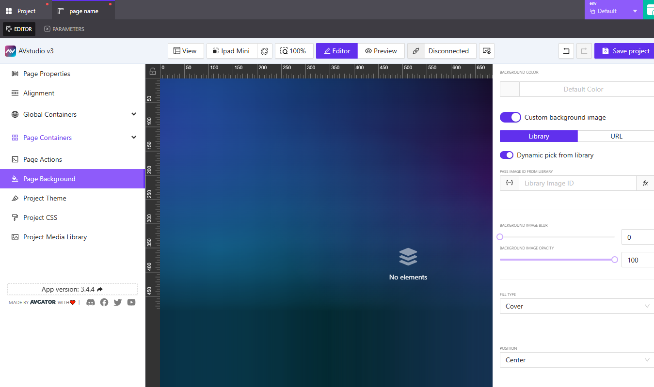
Custom Background Image
Toggling Custom background image unlocks additional settings. When enabled, you can select one of two image sources:
1. Library
Choose this option to pick an image from your Media Library.
- Click
Pick Imageto open the library and choose an asset - You can also enable Dynamic pick from library, which allows the background to change based on a dynamic value (like a parameter or variable)
- When this toggle is on, you’ll be prompted to enter a
Library Image ID- You can assign this dynamically using variables, parameters, or state entries
- You also have the option to assign a post-processing function (e.g., resize or crop logic)
This method is useful when displaying project-specific assets or background variations based on app state.
2. URL
Alternatively, you can load an external image via a URL.
- Enter the external image URL manually
- Or assign a dynamic value using variables, parameters, or state entries
This method is helpful when referencing external resources or using CDN-hosted images.
Additional Image Styling
Once a background image is selected (via Library or URL), the following visual options become available:
Background Image Blur
Use the blur slider or input field to soften the image. A value of 0 means no blur. Higher values increase the blur intensity.
Background Image Opacity
Set the image transparency level from 0 (completely transparent) to 100 (fully opaque). This is especially useful when layering content over an image.
Fill Type
Defines how the image fits into the background container.
Cover: Fills the container while maintaining the image’s aspect ratio (recommended default)Contain: Resizes the image to fit within the container without croppingFill: Stretches the image to fit both width and height (may distort)Custom size: Lets you define exactWidthandHeightvalues
If you choose Custom size, you’ll be able to:
- Enter specific background width and height
- Set units in
%orpx - Assign dynamic values if needed
Position
This setting determines the image’s anchor position within the page.
- Options:
Center(default),Top,Bottom,Left,Right
This is especially useful when working with Custom size, as it allows you to align the image with your layout’s focal point.
Summary
The Page Background section provides a flexible way to style your page's canvas. Whether you're using a simple color or a dynamic image from your media library, you have full control over how it’s rendered and displayed.
Use:
- Color backgrounds for lightweight UIs
- Library images for branded or stored visuals
- External URLs for dynamic or external image sources
- Fill and Position options to refine presentation across screen sizes
Try combining background blur with low opacity to create elegant overlays and improve text contrast.