Color Picker
The Color Picker element allows users to select any RGB color dynamically. It is fully responsive and adapts to the parent container’s size.
This guide shows you the two ways you can add the Color Picker element to your project.
Add via Element List
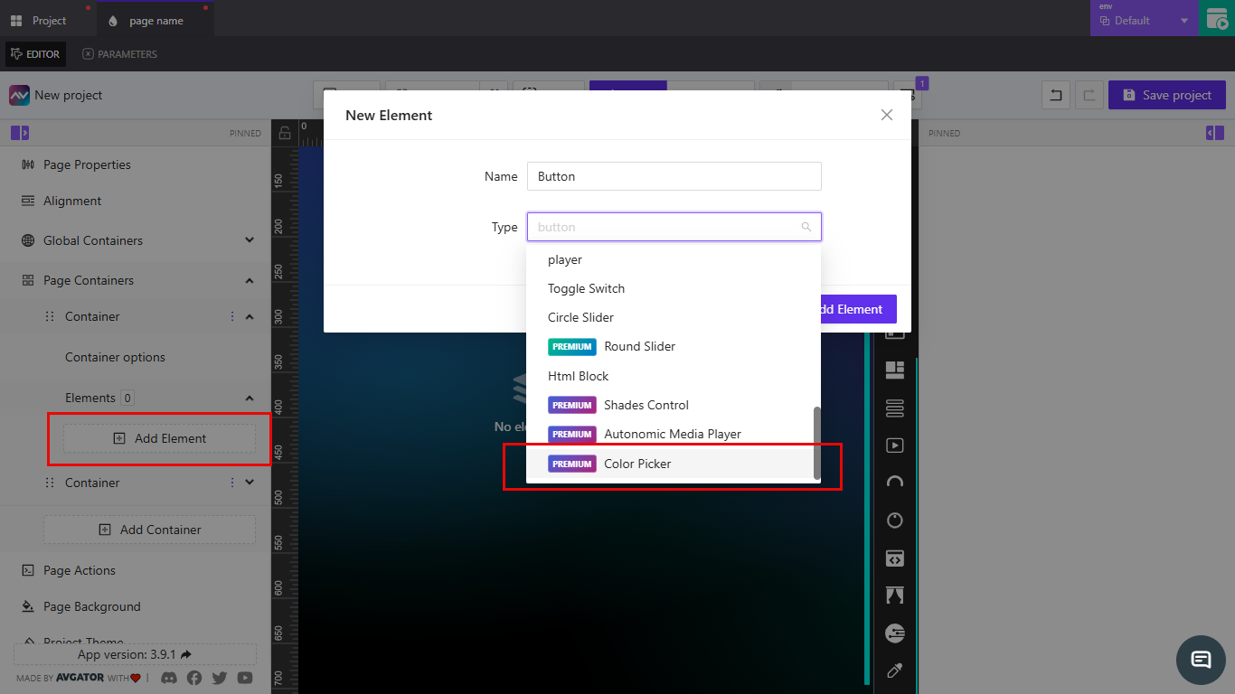
- In the left sidebar, click Add Element.
- From the New Element window, type or scroll to select Color Picker.
- Click Add Element to insert it into your container.
Use this method if you’re already working inside a container and want to insert the element directly.
Add via Drag and Drop
- In the left toolbar, locate the Color Picker icon.
- Drag and drop it onto the canvas or into a container.
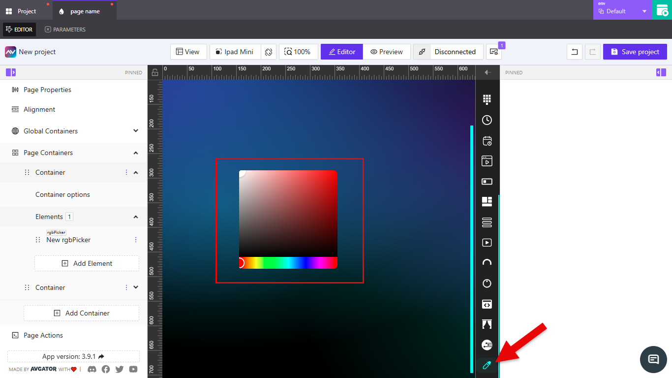
This method is faster if you want to position the element freely on the canvas.
Element Options
After adding the Color Picker, you can configure its behavior and appearance using the options available in the right-hand panel.
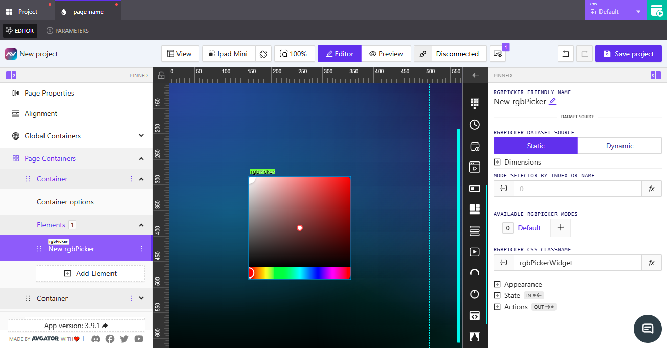
Friendly Name
Set a clear name for the element. This is useful for identifying it in your project structure, especially when working with multiple Color Pickers.
Dataset Source
Choose how the Color Picker stores and provides its color value.
- Static: The value is fixed within the project.
- Dynamic: The value can change based on external inputs such as parameters, variables, or API data.
Dimensions
Define the size of the Color Picker element.
- Width: Set the width as a percentage of the container or in pixels.
- Height: Set the height in pixels.
Use percentages for width when you want the element to scale with its container, and fixed pixel values for height to keep consistent sizing.
Mode Selector by Index or Name
Allows the Color Picker to switch between modes based on a parameter or feedback signal. Enter the index or the name of the mode you want to link.
Available RGBPicker Modes
Define the available modes for the Color Picker.
- Mode 0 is always the default.
- Add more modes as needed to customize behavior.
CSS Classname
Assign a CSS class to the element. This lets you style it with custom CSS rules.
Use unique class names when you need to apply different styles to multiple Color Pickers in the same project.
Appearance
Control the visual style of the Color Picker element. You can adjust its border, shadow, and reflection.
- Border: Choose between the default border or override it with custom settings.
- Shadow: Add depth by enabling a shadow effect.
- Reflection: Apply a reflection effect to the element for a glossy look.
Keep borders and shadows subtle to maintain readability. Overuse of reflections may distract from the main interface.
State
Manage how the Color Picker behaves in different states and how it responds to external inputs.
-
Hex Color Value:
- Direct Value: Enter a fixed hex color code.
- Crestron FB: Link to a Crestron feedback signal for integration.
-
Direct Hex Color: Bind a parameter or variable that supplies a hex color dynamically.
-
Visibility:
- Orientation Visibility: Choose whether the element is visible in portrait, landscape, or both.
- Visibility Dynamic Value: Set visibility based on a parameter.
- Visibility Signal: Link to a signal that controls visibility.
- Reserve Space While Hidden: Keep layout space even when the element is hidden.
-
Disabled Signal: Assign a signal to control whether the element is enabled or disabled.
Use dynamic values and signals for visibility when you want the Color Picker to appear only under specific conditions, such as user roles or device orientation.
Actions
Define what happens when users interact with the Color Picker. Actions let the element send data, trigger events, or update other parts of the project.
- Add New Action: Create a new action and configure its behavior (for example, send the selected color value to another element or system).
- Each action can be linked to signals, parameters, or external data channels.
Use actions to connect the Color Picker with other interactive elements, such as applying the selected color to a button background or sending values to a connected control system.