Round Slider Element
The Round Slider element in AVStudio provides a circular slider interface that can display or control values. It is useful for volume controls, progress indicators, or any scenario where a round, interactive slider is preferred.
How to Add a Round Slider
- Open your project in AVStudio and go to the
Editorview. - From the left panel, expand
Page Containers, then selectContainer. - Under
Container Options, click onElements. - Click
Add Element, chooseRound Slider, then clickAdd Element.
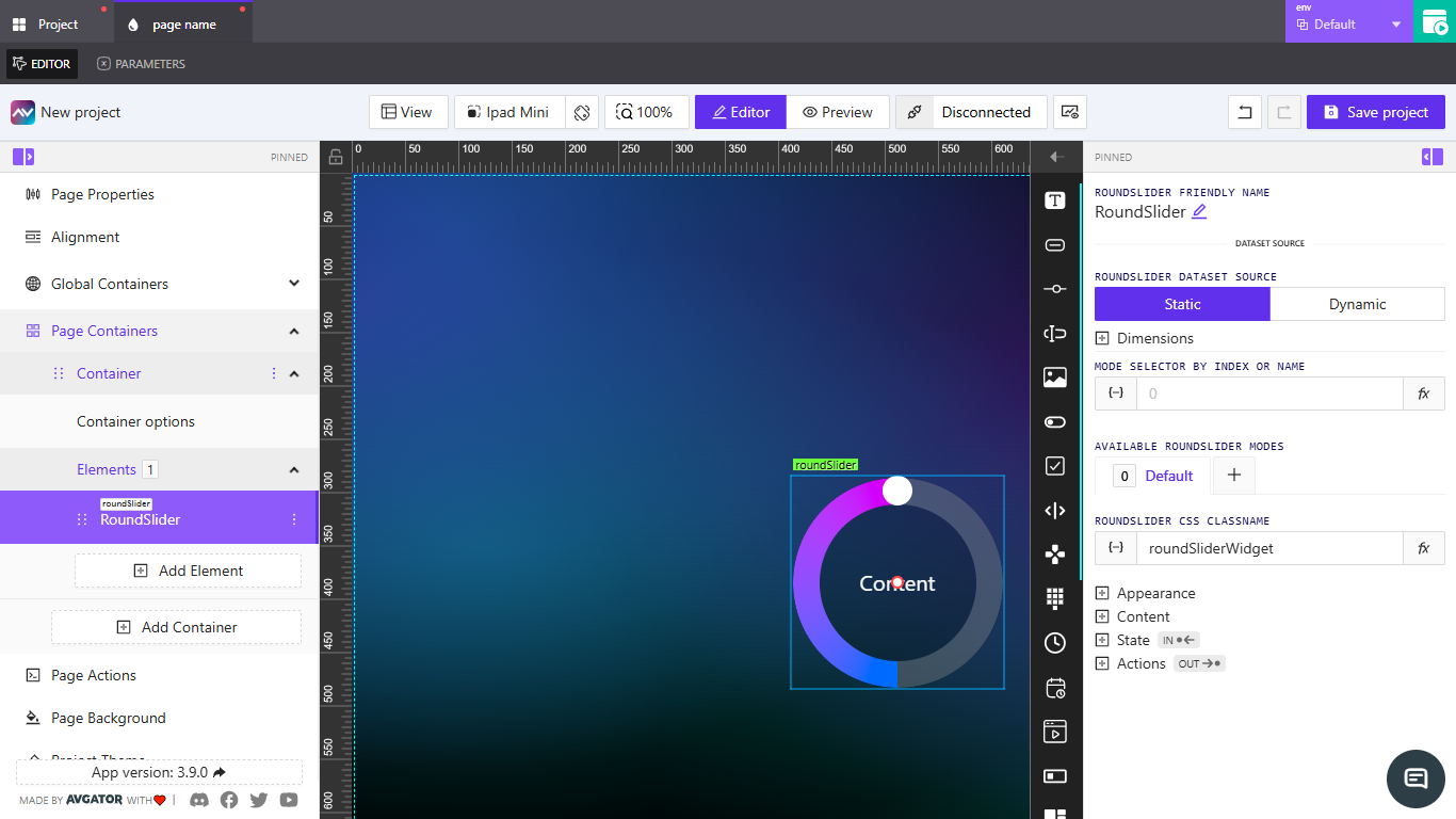
RoundSlider settings overview
When selected, the element’s settings appear in the right panel. The following labels and casing match the UI.
RoundSlider friendly name
- Edit the displayed name for the element.
RoundSlider dataset source
- Static — enter a fixed value or bind using
{-}; apply a function withfx. - Dynamic — bind to a dataset so the value updates at runtime.
Dimensions
- Width — set width (supports
px,%, etc.; can bind with{-}or usefx). - Height — set height (supports
px,%, etc.; can bind with{-}or usefx).
Mode selector by index or name
- Select the active mode using a number or a mode name (supports
{-}andfx).
Available RoundSlider modes
- Default — initial mode.
+— add a mode (can copy from an existing mode and choose separate actions per mode).
RoundSlider CSS Classname
- Assign a class name (supports
{-}andfx).
Appearance
- Color
- Inner content text color — choose via color picker, hex/RGBA, bind
{-}, orfx.
- Inner content text color — choose via color picker, hex/RGBA, bind
- Background
- Circle body background — background color of the circle body.
- Handle background — background color of the handle.
- Track
- Default track — color of the inactive track.
- Active start background — start color of the active arc.
- Active end background — end color of the active arc.
- Size
- Track size — thickness of the circular track (px; supports
{-}/fx). - Handle size — size of the handle (px; supports
{-}/fx).
- Track size — thickness of the circular track (px; supports
- Font
- Font family — choose a font.
- Font size — size of text inside the slider (px; supports
{-}/fx).
- Border
- Circle Body — Default / Override.
- Handler — Default / Override.
- Shadow
- Circle Body — None / Enabled.
- Handle — None / Enabled.
- Reflection
- None / Enabled.
- Align — Top / Bottom / Left / Right.
- Offset — distance of the reflection.
- Start opacity — starting opacity value.
- End opacity — ending opacity value.
Content
- Inner text — text displayed in the center.
- Min value — lower bound (default is 0; supports
{-}/fx). - Max value — upper bound (default is 100; supports
{-}/fx).
State
- Value — Direct Value / Crestron FB.
- Number value — current numeric value (supports
{-}/fx). - Visibility
- Orientation visibility — Both / Mobile / Desktop.
- Visibility dynamic value — bind logic (
{-}/fx). - Visibility signal — signal-controlled visibility.
- Reserve space while hidden — keep layout space.
- Disabled signal — bind a signal to disable interaction.
Actions
- Add new action — create an action for this element.
- Create new action for roundSlider
- Name — action label.
- Behaviour — e.g., On Change.
- Execution Delay — optional (ms).
- Tabs — Crestron / Routing / Variables / Parameters / Overlays / Functions / HTTP Web Requests / Web Sockets / Audio.
- For Crestron (example)
- Type — e.g., Push Digital.
- Signal name — required (bind with
{-}if needed). - Push onChange Value / Push custom Value.