Keypad Element
The Keypad element provides a customizable on-screen keypad that users can interact with. This element is often used for numeric entry, PIN input, or other forms of digital control. The Keypad element can be static or dynamic, with various size and mode options.
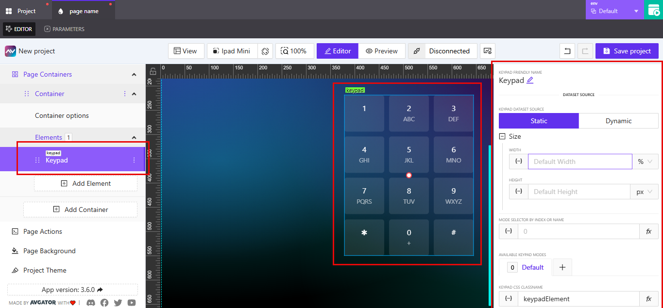
Dataset Source
The keypad can use a static or dynamic dataset source:
Static: Fixed layout with standard key arrangements.Dynamic: Layout or values may change based on external input or configuration.
Size
You can customize the Width and Height of the keypad using:
- Width Units: %, px, vw, vh
- Height Units: px, %, etc.
Each dimension supports dynamic input via variables or expressions.
Mode Selector by Index or Name
- Define or bind the mode of the keypad using a numeric index or a named reference.
- This allows switching between predefined keypad configurations.
Available Keypad Modes
- Default mode is always available.
- Additional modes can be defined using the
+button. - Modes allow different layouts or key mappings based on context.
Keypad Friendly Name
- Rename the element for easier identification in complex layouts.
CSS Class Name
- Customize styling by assigning a class in the
Keypad CSS ClassNamefield.
Sizing
The Sizing section controls the font sizes and internal spacing of the keypad keys.
Numbers Text Size– adjusts the font size of the digits (1–9, 0, *, #).Letters Text Size– adjusts the font size of the letters underneath the digits (e.g., ABC, DEF).Default Gap– controls the spacing between individual keypad buttons.
All values support unit selection (px, %, etc.) through the dropdown beside each input.
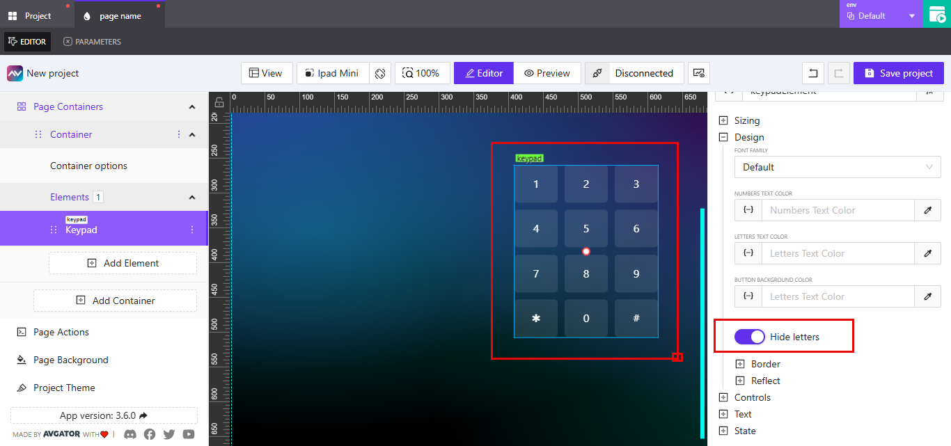
Design Settings: Hide Letters, Border, and Reflect
The Design section under the keypad element allows customization of font styling, visibility, and visual enhancements.
Hide Letters
Use the toggle labeled Hide letters to control the display of character labels under numbers.
- When enabled, only the numeric values are shown.
- When disabled, the character labels (e.g., ABC under 2) remain visible.
Border
Customize the border appearance of each button in the keypad.
DefaultorOverride: Choose whether to apply the theme's default border or override it.Border Width: Specify the thickness for top, right, bottom, and left edges.Style Options: Choose fromSolid,Dashed, orDotted.Color: Set a specific color for the border.Border Radius: Adjust the roundness of the corners.- Presets are available for common shapes (e.g., square, slightly rounded, fully rounded).
Reflect
Add a reflection effect to the buttons.
NoneorEnabled: Toggle the reflection feature.Align: Choose the reflection direction (e.g.,Bottom).Offset: Controls the distance of the reflection from the base element.Start Opacity: Defines the visibility at the starting edge of the reflection (0–100).End Opacity: Defines the visibility at the end of the reflection (0–100).
Controls
Use the Controls section to assign dynamic signals to each button on the keypad. These fields determine the interaction logic for each keypress.
| Button Label | Signal Field Name |
|---|---|
| 1 | Button 1 Signal |
| 2 | Button 2 Signal |
| 3 | Button 3 Signal |
| 4 | Button 4 Signal |
| 5 | Button 5 Signal |
| 6 | Button 6 Signal |
| 7 | Button 7 Signal |
| 8 | Button 8 Signal |
| 9 | Button 9 Signal |
| * | Button Extra1 Signal |
| 0 | Button 0 Signal |
| # | Button Extra2 Signal |
Each signal input accepts a dynamic expression that is triggered when its corresponding button is pressed. These are typically used to send values or activate logic blocks within the project.
Text
The Text section allows you to define the main label and optional subtext for each keypad button. These values determine what is displayed on the keypad interface.
Each button includes two fields:
Text: The main label shown at the top of the button.Subtext: A secondary label shown beneath the main text.
| Button Label | Text Field Name | Subtext Field Name |
|---|---|---|
| 1 | Button 1 Text | Button 1 Subtext |
| 2 | Button 2 Text | Button 2 Subtext |
| 3 | Button 3 Text | Button 3 Subtext |
| 4 | Button 4 Text | Button 4 Subtext |
| 5 | Button 5 Text | Button 5 Subtext |
| 6 | Button 6 Text | Button 6 Subtext |
| 7 | Button 7 Text | Button 7 Subtext |
| 8 | Button 8 Text | Button 8 Subtext |
| 9 | Button 9 Text | Button 9 Subtext |
| * | Button Extra1 Text | Button Extra1 Subtext |
| 0 | Button 0 Text | Button 0 Subtext |
| # | Button Extra2 Text | Button Extra2 Subtext |
You can enter static text or use dynamic expressions to populate these fields based on project logic or external inputs.
State
The State section controls how and when the keypad is displayed, based on orientation, visibility rules, and signal-driven conditions.
Orientation Visibility
Choose whether the element should appear in portrait, landscape, or both orientations.
- Options:
Portrait,Landscape,Both
Visibility Dynamic Value
A dynamic value that defines the condition under which the keypad is visible. This can be set using expressions or variables.
Visibility Signal
This signal input allows external control of the keypad’s visibility.
Reserve Space When Hidden
If enabled, the keypad will still occupy space in the layout even when hidden. If disabled, the space will collapse when the keypad is hidden.
Shared Disabled Signal
This lets you disable the keypad using a shared signal, typically used to prevent interaction while keeping it visible.