Image Element
The Image element allows you to display images inside your project layout, with options for size, stretching behavior, and positioning.
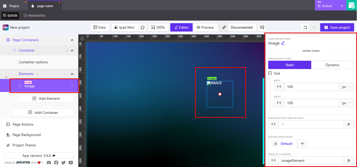
Image Friendly Name
You can rename the element label by clicking the pencil icon beside the default name. This is for visual organization and does not affect functionality.
Dataset Source
The Dataset Source defines where the image gets its data.
Static: The image is fixed and does not depend on external data sources.Dynamic: The image can be linked to data-driven content.
Size
The Size section allows you to set the dimensions of the image element.
WidthandHeightvalues can be defined in pixels or percentages.- You can use the increment (
+) or decrement (–) buttons to adjust values.
Mode Selector
The Mode Selector by Index or Name field allows you to control which image mode is currently active. You can enter an index value or a name string.
Available Image Modes
Multiple image modes can be defined and switched based on logic or user interaction. The Default mode is always present, but additional modes can be added by selecting the + button.
Image CSS Classname
This field allows you to assign a custom CSS class to the image element (default: imageElement).
Stretch
The Stretch section allows you to control how the image is sized and positioned within its container. It includes the following settings:
Fill Type
The Fill Type setting determines how the image fills the available space in the container.
Cover: The image fills the container while maintaining its aspect ratio. Some parts of the image may be clipped.Contain: The image scales to fit entirely within the container while preserving its aspect ratio. May result in empty space around the image.Fill: The image stretches to fill the container completely. This may distort the image if the container's aspect ratio differs from the image.
Vertical Position
The Vertical Position setting controls the vertical alignment of the image within its container.
Top: Aligns the image to the top.Center: Centers the image vertically.Bottom: Aligns the image to the bottom.
Horizontal Position
The Horizontal Position setting controls the horizontal alignment of the image within its container.
Left: Aligns the image to the left.Center: Centers the image horizontally.Right: Aligns the image to the right.
Border
The Border setting allows you to control how the border of the image element appears. It supports two modes:
Default: Inherits the styling from the theme or container defaults.Override: Lets you configure custom border styling directly on the element.
Border Settings in Override Mode
Border Width: Specify custom width for each side of the image (top, right, bottom, left).Border Style: Choose from:SolidDashedDotted
Border Color: Set a custom color for the border.Border Radius: Adjust the curvature of the image’s corners.Individual Corner Radius: Optionally set different radius values for:- Top-left
- Top-right
- Bottom-right
- Bottom-left
Shadow
The Shadow setting allows you to add a visual shadow effect to the image element. This can help emphasize the image or give it a lifted appearance.
- None / Enabled: Choose whether the shadow is disabled or enabled.
When Enabled, you can configure the following options:
- X Offset: Moves the shadow horizontally.
- Y Offset: Moves the shadow vertically.
- Blur: Controls the blur intensity of the shadow (higher values = softer shadow).
- Spread: Increases or decreases the size of the shadow.
- Color: Sets the color of the shadow.
- Inset Shadow: Toggles between outer and inner shadow.
Reflect
The Reflect section allows you to add a mirrored reflection to the image element.
Enable/Disable
None: Reflection is disabled.Enabled: Reflection is enabled and the following settings become available:
Align
Controls where the reflection appears relative to the image.
BottomTop
Offset
Adjusts the distance of the reflection from the image.
Start Opacity
Defines the starting opacity level of the reflection. Accepts values from 0 (fully transparent) to 100 (fully opaque).
End Opacity
Defines the ending opacity level of the reflection. Accepts values from 0 to 100, creating a fade effect.
Source
The Source section allows you to define where the image file is loaded from and how it behaves on load.
Lazy Load: When enabled, the image will load only when it enters the viewport, improving performance for pages with many images.
You can choose from two image source types:
Library
Use this option to select an image from the media library. Click Pick image to browse and choose a file from the library. You may also enable Dynamic pick from library to select an image dynamically based on logic or variable references.
URL
Use this option to specify an external image by entering a URL. This is useful when your image is hosted outside the AVStudio environment. A field labeled External Image Url is provided for input.
Actions
The Actions section allows you to define specific behaviors triggered by interactions with the image element. You can add one or more actions to perform tasks such as sending signals or executing functions.
To create a new action:
-
Click
Add new action. -
Configure the following fields:
Name: Enter a name for the action.Behaviour: Choose the interaction that will trigger the action (e.g.,Tap).Force Tap Execution: Toggle this setting if you want the tap behavior to execute regardless of conditions.Execution Delay: Optional. Specify a delay in milliseconds before the action runs.
-
Use the available tabs to define the action logic:
Crestron
Type: Choose from available Crestron command types (e.g.,Push Digital).Signal Name: Enter the name of the Crestron signal.Push Data: Select one of the following values:TrueFalsePulseMomentarily
Routing
- Define routing actions as needed.
Variables
- Assign or modify variable values.
Parameters
- Provide parameters to use in your action logic.
Overlays
- Trigger overlays to appear or disappear.
Functions
- Call custom functions defined in the system.
HTTP Web Requests
- Send an HTTP request to an external service.
Web Sockets
- Send a message over a web socket connection.
Audio
- Trigger audio playback or configure audio behavior.
Once all settings are configured, click Create action to save it. The action will now appear in the action list for the selected image.
State
The State section controls the visibility and interactivity of the image element based on orientation, variables, and signals.
Orientation Visibility
Select how the element behaves based on screen orientation:
Both: Visible in both portrait and landscapePortrait: Visible only in portrait modeLandscape: Visible only in landscape mode
Visibility Dynamic Value
Bind a variable to control whether the image is shown or hidden dynamically.
- Example: A variable that toggles visibility based on a condition or event.
Visibility Signal
Bind a signal to manage visibility.
-
Example: A Crestron signal controlling whether the image is shown.
-
Toggle
Reserve space when hiddenif you want the element to occupy space even when hidden.
Disabled Signal
Use this to bind a signal that controls whether the image is interactive.
- When disabled, the element cannot be interacted with.