Checkbox Element
The Checkbox element in AVStudio allows users to toggle a value on or off. It's useful for filtering, form controls, or triggering logic based on user interaction.
How to Add a Checkbox
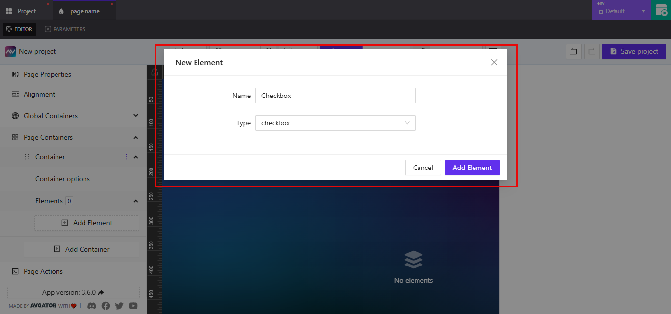
- Open your project in AVStudio and go to the
Editorview. - From the left panel, expand
Page Containers, then selectContainer. - Under
Container Options, click onElements. - Click
Add Element, chooseCheckboxfrom the dropdown, then clickAdd Element.
Checkbox Settings Overview
Once selected, the checkbox's settings appear in the right panel.
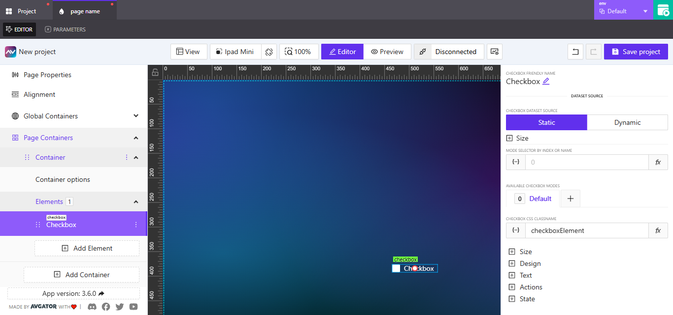
Checkbox Friendly Name
This is the label used to identify the checkbox in your layout.
- Click the pencil icon next to the existing name to edit it.
- Once updated, the new name will reflect across your project and help identify the element more easily.
Checkbox Dataset Source
This controls how data is assigned to the checkbox element. You can choose between:
Static(default)Dynamic
Static
Under the Static option, you can manually configure values. One available setting here is Size.
Note: This
Sizerefers to the dataset logic space — not the visual size of the checkbox itself.
- You can manually enter a value for
WidthandHeight. - Use
pxfor pixels or%for percentage-based sizing. - To bind a value dynamically, click the
{-}icon (curly bracket–dash–curly bracket) beside the field.
This allows for precise control over how the dataset behaves when statically assigned.
Mode Selector by Index or Name
This field allows you to control which checkbox mode is active, either by referencing its index or its name.
You have two configuration options:
Assign Dynamic Value: Click the {-} icon to bind Pick Dynamic Value to choose from available:
VariablesParametersState entries
This is useful when you want the value to change based on app logic or user interaction.
Assign Post-Processing Function: Click the fx icon to apply a post-processing function that manipulates the value before it's used.
- Opens a dropdown that allows you to apply a function to the selected value
- Common use cases include formatting, conditional logic, or calculation
These options give you control over how the field behaves both at runtime and during configuration.
Available Checkbox Modes
The Available Checkbox Modes setting lets you define different states for the checkbox, allowing you to control its behavior and appearance based on logic or user interaction.
To create a new checkbox mode:
-
Click the
+button next to theAvailable Checkbox Modesfield. -
In the dialog titled
Create new checkbox mode, configure the following:Name: Enter a name for your new mode (e.g.,NewMode,Selected,CustomState).Copy from: Choose an existing mode to copy settings from. By default, this is set toDefault.Separate actions for this mode: Toggle this ON if you want this mode to have its own set of actions instead of sharing actions with the default mode.
-
Click
Add New Modeto save and apply the new mode.
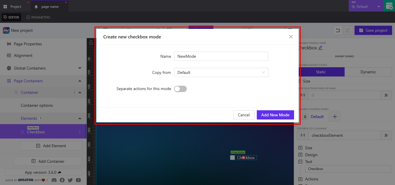
Modes are useful for customizing a single checkbox’s behavior across different page conditions or application states.
Checkbox CSS ClassName
The Checkbox CSS ClassName field allows you to assign a custom CSS class to the checkbox element. This class can be used to apply consistent styling across multiple elements or pages.
To configure this field:
-
Enter a class name directly into the
Checkbox CSS ClassNamefield (e.g.,checkboxElement,customCheckbox,filterToggle). -
If you want to bind the class name dynamically:
- Click the
{-}icon to open thePick Dynamic Valuedialog. - Select a
parameter,variable, orstateentry to dynamically assign the class.
- Click the
-
Optionally, click the
fxicon to assign a post-processing function to modify the class name before it is applied.
Use consistent and descriptive class names to make styling and layout control easier across your project.
Size
The Size section allows you to adjust the dimensions and spacing of the checkbox element's content.
To configure size settings:
-
Expand the
Sizesection from the checkbox's settings panel. -
Adjust the following fields:
-
Text Size: Sets the size of the text label next to the checkbox.- Enter a numeric value.
- Use the dropdown to choose the unit (
px,vh,vw). - Click the
{-}icon to assign a dynamic value. - Click the
fxicon to apply a post-processing function.
-
Default Gap: Sets the spacing (gap) between the checkbox and its label or internal elements.- Enter a numeric value.
- Select a unit (
px,vh,vw) using the dropdown. - Dynamic values and post-processing functions are also supported here.
-
These settings affect only the content size and spacing, not the dataset source size, which is configured separately under
Checkbox Dataset Source > Static > Size.
Design
The Design section allows you to adjust the visual styling of the checkbox element, including font, label alignment, colors, and reflection.
To configure the design settings:
-
Expand the
Designsection from the checkbox's settings panel. -
Configure the following properties:
-
Font Family: Choose the font type used for the checkbox label. Options typically includeDefaultand any custom fonts available in your project. -
Label Position: Select where the label appears relative to the checkbox. Available options include:TopRightBottomLeft
-
Checkbox Checked-State Background Color: Set the background color of the checkbox when it is checked. Click the color box to open the color picker and choose from preset colors or enter a hex/RGBA value. -
Checkbox Checked-State Tick Color: Set the color of the checkmark/tick icon when the checkbox is in the checked state.
-
-
Expand the
Reflectsection to enable a mirrored reflection effect.- Toggle between
NoneandEnabledto activate or deactivate the reflection. - Configure the following reflection properties:
Align: Set the reflection direction. Options includeTop,Bottom,Left, andRight.Offset: Adjusts the distance between the checkbox and its reflection.Start Opacity: Controls the opacity at the beginning of the reflection gradient.End Opacity: Controls the fade-out opacity of the reflection.
- Toggle between
Use design settings to ensure visual consistency across your project and to enhance the appearance of form controls.
Text
The Text section lets you define the label that appears next to the checkbox.
To configure the checkbox label:
-
Expand the
Textsection in the checkbox settings panel. -
Enter a value into the text field. This will be displayed beside the checkbox.
- For example: entering
Subscribe to newsletterwill render that text as the checkbox label in the layout.
- For example: entering
Actions
The Actions section allows you to define what the checkbox should do when the user interacts with it.
To add an action:
-
Expand the
Actionssection in the checkbox settings panel. -
Click the
Add new actionbutton. -
In the
Create new action for checkboxdialog, configure the following fields:Name: Enter a label to identify the action (e.g.,Toggle Light,Submit Consent).Behaviour: Choose when the action is triggered. For checkboxes, this is typically set toOn Change.Execution Delay: (Optional) Set a delay in milliseconds if needed before the action is executed.
-
Choose an action type from the available tabs:
CrestronRoutingVariablesParametersOverlaysFunctionsHTTP Web RequestsWeb SocketsAudio
-
Under the selected tab, configure the action logic. For example, under the
Crestrontab:Type: Choose the signal type, such asPush Digital.Signal Name: Enter or assign the target signal.- Choose whether to
Push onChange ValueorPush custom Value.
-
Click
Create actionto save.
You can add multiple actions per checkbox. Each can be tailored to execute different logic depending on project needs.
State
The State section controls the checkbox's visibility, availability, and checked status across different device orientations and conditions.
To configure the checkbox state:
-
Set
Orientation Visibilityto determine where the checkbox should appear:Both: Display on all devicesMobile: Show only on mobile devicesDesktop: Show only on desktop devices
-
Configure visibility settings:
Visibility Dynamic Value: Bind a value to determine whether the checkbox is shown or hidden based on logic.Visibility Signal: Assign a signal to control visibility dynamically.Reserve space when hidden: Enable this toggle if you want the layout to maintain space even when the checkbox is hidden.
-
Configure interactivity:
Disabled Signal: Use this field to disable the checkbox based on a condition or signal. When disabled, the checkbox cannot be interacted with.
-
Configure status logic:
Checked Status Signal: Bind a signal or variable to reflect or control the checked state of the checkbox.
These settings are useful when customizing behavior across device types, controlling visibility with logic, or syncing UI state with system parameters.