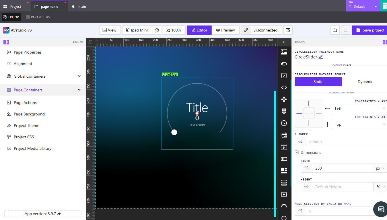
How to Use the Circle Slider Element
🎯 Learn how to configure and customize the Circle Slider element to display values or indicators using a circular visualization.
This guide explains how to link data, adjust sizing, and control the look and behavior of the Circle Slider.
👉 Adding a Circle Slider
- Add a new element to your layout.
- From the element list, select Circle Slider.
- Enter a friendly name to identify the slider (e.g.,
VolumeKnoborProgressDial).

👉 Setting the Data Source
The Circle Slider supports two dataset source types:
- Static – Displays fixed values or default placeholders.
- Dynamic – Uses connected variables, parameters, or signals that change in real time.
Select the appropriate option under CircleSlider Dataset Source.
👉 Adjusting Constraints and Dimensions
Use the Element Constraints options to position the Circle Slider along the X and Y axes.
For detailed setup, see How to Configure Element Constraints.
Set the Width and Height fields under Dimensions to define the slider’s size.
Refer to How to Configure Dimensions for measurement details.
👉 Mode and Styling
Each Circle Slider can have one or more display modes.
You can define or add available modes under Available CircleSlider Modes.
- CSS Classname – Apply or customize styles using a specific class (e.g.,
circleSliderWidget). - Font Family – Choose from default or project fonts.
- Handle Size and Track Width – Adjust the visual thickness of the circle and its movable handle.
- Colors – Define handle, start, and end colors. You can also toggle Use interpolated color to create smooth gradients.
👉 Content and Value Display
You can configure text fields that appear within or around the slider:
- Pre Title Text – Optional label shown above the title.
- Title – Main label or heading for the slider.
- Pre Value Text – Text displayed before the value (e.g., “Level:”).
- Value Signal – Dynamic input controlling the displayed value.
- Start (Min) and End (Max) Values – Define the numeric range.
- Description – Optional field for context or instruction text.
You can also format the Value Display Options to automatically show fractional or integer outputs.
👉 Actions and State
Add actions under the Actions section to trigger specific responses based on user interaction.
For visibility control, expand State and adjust Orientation Visibility or Disabled Signal as needed.
See Assigning Dynamic Values for linking logic and signals.
📌 Key Points
- The Circle Slider can display analog or fractional values.
- Supports both static and dynamic data sources.
- Use interpolated colors for gradient effects.
- Customize fonts, colors, and handle size for branding consistency.
- Combine with actions and states for dynamic interaction.
❓ Frequently Asked Questions (FAQ)
Can I use the Circle Slider for both input and display?
Yes. Depending on configuration, it can either reflect a live value or be used as an interactive input control.
What is the default range for the slider?
By default, it operates between 0 and 100, but you can modify this using the Start and End value fields.
Can I show units like °C or %?
Yes. Add text before or after the value in Text Before Value or Text After Value.