How to Use the Player Element
🎯 The Player element is used to display and control media playback within your project.
This article explains how to add and configure a Player, manage its data sections, and customize its behavior through visibility and state settings.
This guide covers:
- Adding the Player element
- Editing its properties
- Managing playback data and visibility
👉 Adding a Player Element
To add a Player element, follow the steps in How to Add an Element.
Once added, you can select it in the Editor to configure its properties and behavior.
👉 Player Properties Overview
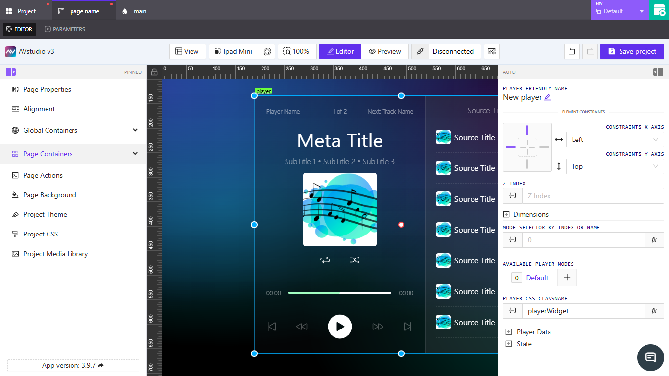
When you select a Player element, the properties panel displays multiple configuration sections.

Player Friendly Name
Defines the label or identifier for the element. Use clear names to make the player easy to find in the hierarchy.
Element Constraints
Sets the X and Y axis alignment within the layout.
These control how the player is positioned relative to its container.
(See the upcoming How to Configure Element Constraints guide.)
Z Index
Controls the layer order of the element. Higher values bring it to the front of overlapping components.
Dimensions
Defines the player’s width and height.
You can enter fixed values or assign dynamic bindings.
See How to Configure Dimensions for details.
Mode Selector by Index or Name
Specifies which playback mode or layout variation the player should display.
Can be bound dynamically using the {–} icon or the Assigning Dynamic Values guide.
Available Player Modes
Lists the modes you can assign to switch between visual or functional layouts (for example, Default, Compact, or Full).
You can create additional modes by clicking the + button beside the list.
Player CSS Class Name
Specifies a CSS class for applying custom styles or visual adjustments to the player.
This allows consistent styling across multiple player instances.
👉 Configuring Player Data
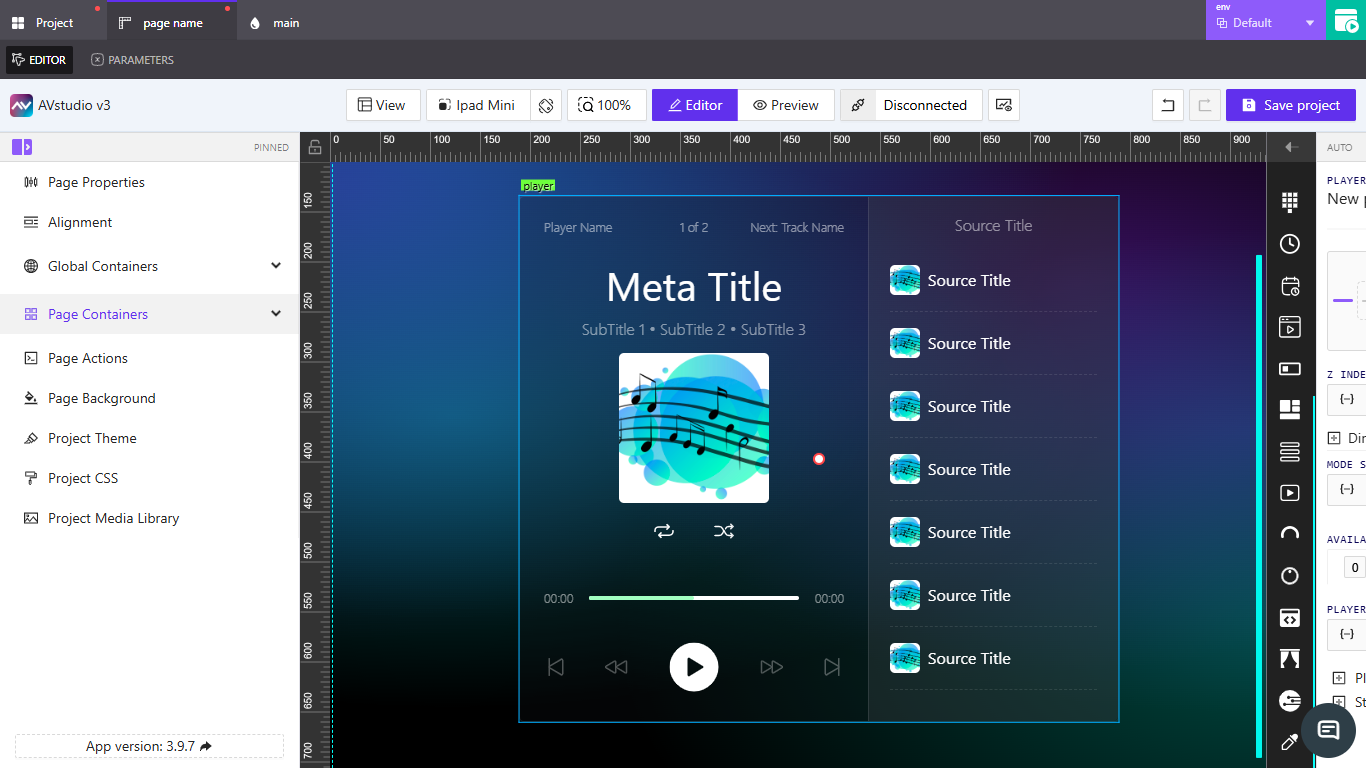
The Player Data section contains grouped properties that define how playback information is displayed and managed.

- Header Text – Defines top-line text such as
Player Name,Current Track, andNext Track Name. - Meta Info – Displays playback details like
Meta Title,Subtitles, andMeta Image. - Repeat / Shuffle – Controls playback modes and signal bindings.
- Seek – Manages playback position, total length, and progress tracking.
- Controls – Includes toggle and feedback options for Play, Pause, and Skip buttons.
- Source List – Lists media sources and selectors for track navigation.
👉 Configuring State and Visibility
The State section manages visibility and conditional rendering.
Visibility
Specifies when the player should be shown based on orientation or dynamic signals.
You can bind visibility to direct values or to Crestron feedback.
📌 Optionally enable Reserve space while hidden to maintain layout consistency when the player is hidden.
📌 Key Points
- The
Playerelement supports multiple playback modes and data bindings. - Use
Player Datagroups to configure information such as metadata, controls, and sources. - Dynamic bindings allow the player to react to live system data.
- Visibility can be tied to feedback or triggers for adaptive layouts.
❓ Frequently Asked Questions (FAQ)
Can I display both audio and video content in one player?
No. Each player instance supports a specific media type — use separate players for different media.
Can I customize the player layout for each mode?
Yes. Create and edit player modes under Available Player Modes to design different visual states.
How can I bind dynamic track information?
Use the {–} icon beside a metadata field and follow the steps in Assigning Dynamic Values.