Subpage List
The Subpage List element allows you to display and manage multiple subpages within a container. It’s useful for showing repeating layouts, dynamic lists, or collections of content that share the same subpage structure.
This guide explains how to add a Subpage List element in AVStudio and configure its appearance, content, and actions.
Adding a Subpage List Element
You can add a Subpage List element in several ways.
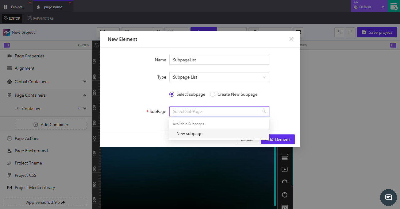
1. From Page Containers
- Go to
ContainerunderPage Containers. - Click the dropdown arrow, select
Elements, and chooseAdd Element. - In the
Typedropdown, selectSubpage List. - Choose whether to
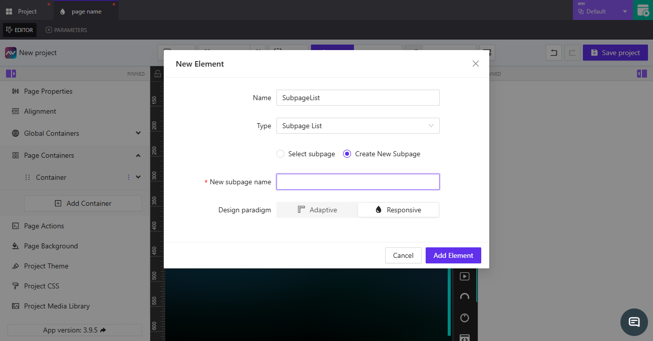
Select subpageorCreate New Subpage.
When Create New Subpage is selected:
- Enter a name in the
New subpage namefield. - Choose a design paradigm:
AdaptiveorResponsive. - Click
Add Elementto create and add the new subpage list.
When Select subpage is selected:
- Use the search bar to select an existing subpage from the project.
- Once selected, click
Add Elementto link it.
2. From the Editor
- Click the subpage list icon in the right-hand toolbar.
- The
Select target subpagemodal opens. - Choose
Select subpageto link to an existing one orCreate New Subpageto make a new one. - Click
Create new subpageListto add it to the layout.
Subpage List Properties
When the Subpage List element is selected in the Editor, its properties appear on the right-hand panel.
SubpageList friendly name
Specifies the name of the subpage list. Click the edit icon to rename it. This name identifies the element across the project.
SubpageList dataset source
Determines how the subpage list receives data.
| Option | Description |
|---|---|
Static | Uses a fixed configuration. |
Dynamic | Opens the Select datasource to work with modal for selecting a data source. |
Dimensions
Defines the width and height of the subpage list container.
| Field | Description |
|---|---|
Width | Enter a value manually or use {-}. The default placeholder shows Default Width. Units: px or %. |
Height | Enter a value manually or use {-}. The default placeholder shows Default Height. Units: px or %. |
Mode selector by index or name
Specifies which mode of the subpage list to use.
You can enter a value directly, use {-}, or click fx to open the Assign post-processing function dropdown.
Available subpageList modes
Displays and manages defined modes.
- The
Defaultmode is created automatically. - Click
+to open theCreate new subpageList modemodal and configure the new mode.
SubpageList CSS classname
Defines the CSS class used for styling.
Enter a class name directly (default: subpageListElement), use {-}, or click fx to assign a function.
Appearance
Controls the background, spacing, and visual styling of the subpage list and its child elements.
Background
| Setting | Description |
|---|---|
List container background color | Pick a color, or use {-} to assign a variable. |
Size
| Setting | Description |
|---|---|
Force children fill list width | Ensures all child items stretch to match the list width. |
Force children fill list height | Ensures all child items stretch to match the list height. |
Padding
Sets padding inside the subpage list container.
Enter a value and select units (px, em, etc.).
Gap
Controls spacing between child elements.
| Setting | Description |
|---|---|
List child elements gap | Sets horizontal or vertical spacing between list items. |
Border, Shadow, and Reflection
| Setting | Description |
|---|---|
Border | Toggle between Default and Override for border styling. |
Shadow | Choose None or Enabled to apply a shadow. |
Reflection | Toggle None or Enabled to add a reflection effect. |
Content
Controls the structure and flow of the items inside the subpage list.
| Setting | Description |
|---|---|
Number of items | Defines how many items appear in the list. |
Child elements flow | Controls the flow direction of child elements. |
Child elements vertical position | Positions items vertically (Top, Center, Bottom). |
Child elements horizontal position | Positions items horizontally (Left, Center, Right). |
Empty list container text | Text shown when the list has no items. Can use {-} for dynamic text. |
State
Controls visibility and signal-based behavior.
Visibility
| Setting | Description |
|---|---|
Orientation visibility | Determines which orientation displays the list (Both, Portrait, or Landscape). |
Direct Value / Crestron FB | Defines whether visibility is controlled directly or by Crestron feedback. |
Visibility dynamic value | Use {-} to dynamically bind visibility. |
Reserve space while hidden | Keeps the container’s layout space when the list is hidden. |
Disabled signal
Defines whether the list is disabled through a signal.
Enter a signal name or use {-} (default: Now Always Enabled).
List Child Item
Each item within the Subpage List is a List Child Item, which inherits layout and style rules from the parent list.
Parameters
Displays parameters from the linked subpage (read-only).
Example: Source subpage New subpage doesn’t have parameters.
Appearance
Includes settings for Background, Font, Border, Shadow, and Reflection identical to the subpage’s styling section.
Content
| Setting | Description |
|---|---|
Select source (target subpage) | Choose between Manual (select from list) or Dynamic by name. |
| Subpage dropdown | Displays available subpages (e.g., New subpage). |
State
| Setting | Description |
|---|---|
Disabled signal | Use {-} or enter a signal to disable a list child item. |
Actions
Add and manage actions triggered by user interactions.
- Click
Add new actionto open theCreate new action for list child itemmodal. - Configure:
Name— name of the action.Behaviour— when it should trigger (e.g.,On Change).Execution Delay— delay in milliseconds (ms).
- Select the target tab (
Crestron,Routing,Variables,Parameters,Overlays,Functions,HTTP Web Requests,Web Sockets, orAudio). - Under the chosen tab, define fields like
Type,Signal Name, and output behavior (Push onChange ValueorPush custom Value). - Click
Create actionto save.