Switch
The Switch element allows you to create an on/off control, often used for toggling features or activating functions in a project.
Summary:
This guide explains how to add a Switch element in AVStudio, access its configuration panel, and customize its dimensions, appearance, and actions.
Adding a Switch Element
There are several ways to add a Switch element in AVStudio.
-
From
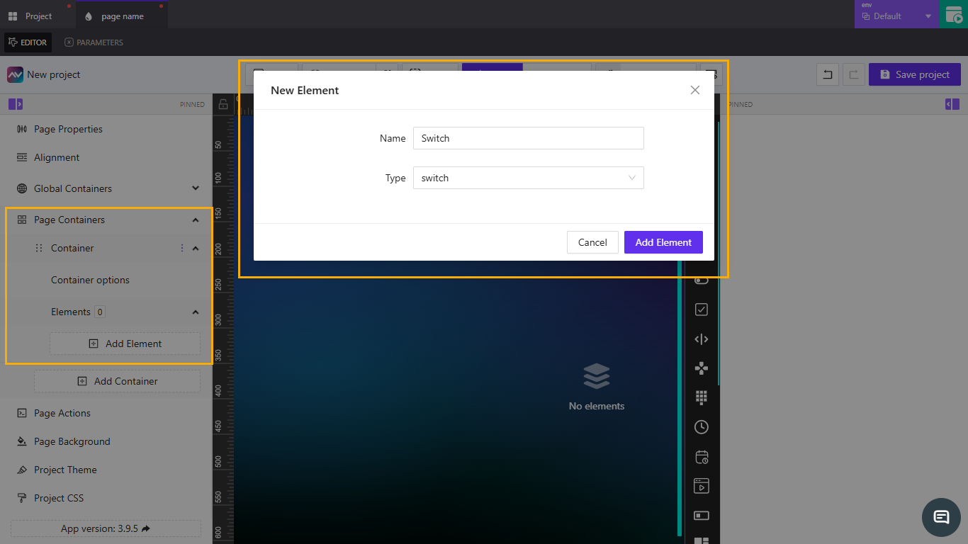
Page Containers- Go to
ContainerunderPage Containers. - Click the dropdown arrow, select
Elements, and chooseAdd Element. - In the
Typelist, selectSwitch, then clickAdd Element. 
- Go to
-
By right-clicking on the
Editor- Right-click anywhere on the
Editor. - Select
Add Element. - From the
Typedropdown, selectSwitch, then clickAdd Element.
- Right-click anywhere on the
-
By dragging from the elements list
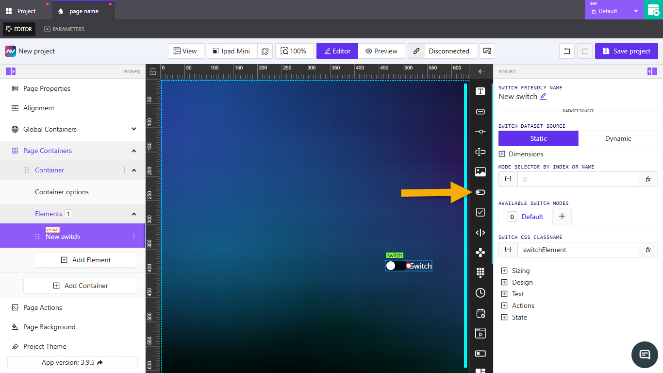
- On the right side of the
Editor, locate theSwitchelement icon in the elements panel. - Click and drag the icon onto the
Editor. - The
Switchelement will be added automatically. 
- On the right side of the
Switch Properties
When the Switch element is selected in the Editor, its properties appear on the right-hand panel. These settings allow you to configure its behavior, design, and interaction.
Switch friendly name
Specifies the name of the element. Click the edit icon to rename it. This name helps identify the element in the Editor and across the project.
Switch dataset source
Determines the source of data for the Switch.
| Option | Description |
|---|---|
Static | No additional configuration is required. |
Dynamic | Opens the Select datasource to work with modal, where you can select an available data source. |
Dimensions
Defines the size of the element.
- Configure
WidthandHeight. - Enter values directly or use
{-}to set dynamic dimensions. - Switch between
px(pixels) and%(percentage) as needed.
Mode selector by index or name
Specifies the mode of the switch using an index or name.
- Enter a value directly or click the
fxicon to open theAssign post-processing functiondropdown. - Use
{-}to open thePick dynamic valuemodal to configure variables, parameters, or state entries.
Available switch modes
Lists all defined switch modes.
- The
Defaultmode is included automatically. - Click the
+icon to open theCreate new switch modemodal, where you can:- Set a
Name. - Choose whether to copy from the default mode.
- Toggle
Separate actions for this switch mode. - Add the new mode.
- Set a
Switch CSS classname
Defines the CSS class for styling the element.
- Enter a class name directly or use
{-}to link a dynamic source. - Default class name:
switchElement. - Click the
fxicon to open theSelect post-processing functiondropdown.
Sizing
Controls the visual proportions of the Switch element, including text size, overall switch size, and internal spacing.
| Property | Description | Units |
|---|---|---|
Text size | Defines font size for switch labels. Enter a value or use {-} dynamically. | px, vh, vw |
Switch size | Choose between small or normal size. | — |
Inner content gap | Sets spacing between inner elements. Enter a value or use {-} dynamically. | px, em, vh, vw |
Design
Controls appearance and visual effects.
| Property | Description |
|---|---|
Font family | Choose a font (default Default). |
Switch order | Set layout order: normal or reverse. |
Switch on-state background color | Opens a color picker for the active state. |
Reflect | Adds reflection. Options: None, Enabled. |
When Reflect is enabled:
| Subsetting | Description | Default |
|---|---|---|
Align | Choose reflection alignment (e.g., Bottom). | — |
Offset | Adjust vertical distance. | — |
Start opacity | Set starting opacity. | 100 |
End opacity | Set end opacity. | 0 |
Text
Defines the text shown when the switch is toggled on or off.
| Field | Description | Default Label |
|---|---|---|
Text | Opens the Edit text modal for formatting or variables. | — |
Switch on text | Appears when switch is on. Accepts dynamic values via {-}. | ON Text |
Switch off text | Appears when switch is off. Accepts dynamic values via {-}. | OFF Text |
Actions
Defines what happens when the user interacts with the Switch.
- Click
Add new action. - The
Create new action for switchmodal opens. - Configure:
Name— action name.Behaviour— when it triggers (e.g.,On Change).Execution Delay— delay inms.
- Select a target tab:
Crestron,Routing,Variables,Parameters,Overlays,Functions,HTTP Web Requests,Web Sockets, orAudio. - Example (
Crestrontab):Type—Push Digital.Signal Name— enter or assign.- Choose
Push onChange ValueorPush custom Value.
- Click
Create actionto save.
State
Controls the visibility and signal states of the Switch.
Visibility
| Setting | Description |
|---|---|
Orientation visibility | Show in Both, Portrait, or Landscape. |
Direct value / Crestron FB | Control visibility directly or via Crestron feedback. |
Visibility dynamic value | Use {-} to control visibility dynamically. |
Reserve space while hidden | Keeps layout spacing when hidden. |
Disabled signal
Defines whether the Switch is disabled via signal input.
| Property | Description | Default |
|---|---|---|
Disabled signal | Enter a signal name or use {-}. | Now Always Enabled |
Checked status signal
Specifies control state for the Switch.
| Property | Description | Default |
|---|---|---|
Checked status signal | Enter a signal name or use {-}. | No Checked Control State |
Key Points
- Use short, descriptive names for better project navigation.
- Use
Dynamicdata sources for reactive switch states. - Keep
ReflectandDesignsimple for performance on large projects.
Frequently Asked Questions (FAQ)
What’s the difference between a Switch and a Toggle?
They are functionally similar. The Switch is used for binary control, while Toggle may include more customized visual behavior.
Can I bind multiple actions to one Switch?
Yes. You can add several actions with different targets (e.g., Crestron + HTTP Web Request) and control their sequence using Execution Delay.