Adding Elements to a Container
Each container in AVstudio can hold one or more elements. These elements define the actual content or controls inside your layout—such as buttons, sliders, inputs, or embedded widgets.
You can add both standard elements and advanced widgets depending on the type of interface you're building. Elements help create interactive UIs, while widgets provide higher-level functionality for media, automation, and custom display.
How to Add an Element
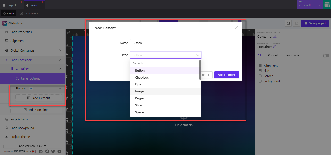
The New Element panel allows you to name and select the type of element you want to add.
To insert a new element into a container:
- Click the
Add Elementbutton under the container - The New Element panel will open
- Enter a clear and descriptive name for your element
Example:SubmitButton,UserNameInput,MainSlider - Choose the element type from the list
- Click
Add Elementto save
The element will now appear under the container’s Elements section where you can modify its properties.
Available Element Types
Standard Elements
These are the most common building blocks used in UI layouts.
| Element Type | Description |
|---|---|
Button | Triggers actions like navigation or logic. Use for submitting forms or toggling views. |
Checkbox | Allows on/off toggling for binary options. Ideal for preferences or filters. |
Dpad | A directional control interface. Useful for navigation in kiosk or media layouts. |
Image | Displays a static image from your media library or a dynamic source. |
Keypad | A numeric keypad for input interfaces like PIN pads or access panels. |
Slider | Allows users to adjust values visually, such as brightness or volume. |
Spacer | Creates intentional space between other elements for layout control. |
SubPage | Inserts a reference to another page within the container. Use for popups or nested views. |
Switch | Similar to a toggle. Used to activate or deactivate settings or features. |
Text | Displays static or dynamic text content. Ideal for labels, instructions, or status. |
Text Input | Allows user input, such as names, emails, or search terms. |
Video | Embeds a video player to show media content inside the container. |
Widgets
Widgets are pre-built, functional components that offer more specialized or advanced features. Some widgets are premium and require a specific license to use.
| Widget Name | Description |
|---|---|
Autonomic Media Player – Premium | Advanced media control for Autonomic systems. Ideal for high-end AV control panels. |
Circle Slider | A rotary-style slider. Useful for volume dials or lighting controls. |
Clock | Displays current time. Use in dashboards or control room interfaces. |
DateTime | Combines date and time selectors or display. Useful for scheduling screens. |
HTML Block | Allows you to embed raw HTML content. Great for custom scripts or third-party widgets. |
Media Player | A general-purpose player for embedded media content. |
Shades Control – Premium | Provides control UI for smart shades or blinds. Often used in home or conference room automation. |
Toggle Switch | A stylized toggle for on/off functionality. Suitable for settings or device control. |
When to Use Widgets:
- Use
Clock,DateTime, orMedia Playerin dashboards, automation panels, or meeting room UIs. - Use
HTML Blockto embed weather widgets, custom branding, or third-party integrations. - Use premium widgets like
Autonomic Media PlayerorShades Controlwhen integrating specialized AV or building automation systems.
Summary
Adding elements is a straightforward process:
- Click
Add Element - Enter a name
- Choose a type (standard or widget)
- Save and configure it in the panel
Elements bring interactivity and structure to your containers, while widgets extend your design with powerful, reusable components.
Name each element based on its purpose (e.g., VolumeSlider, UserEmailInput) to make your layout easier to manage and scale—especially when working with dynamic parameters or logic.