Background Settings in Container Options
The Background section lets you customize how a container looks visually by adding background colors, blur effects, or images. These settings allow you to define the tone and depth of UI sections, making your layout feel more dynamic and styled.
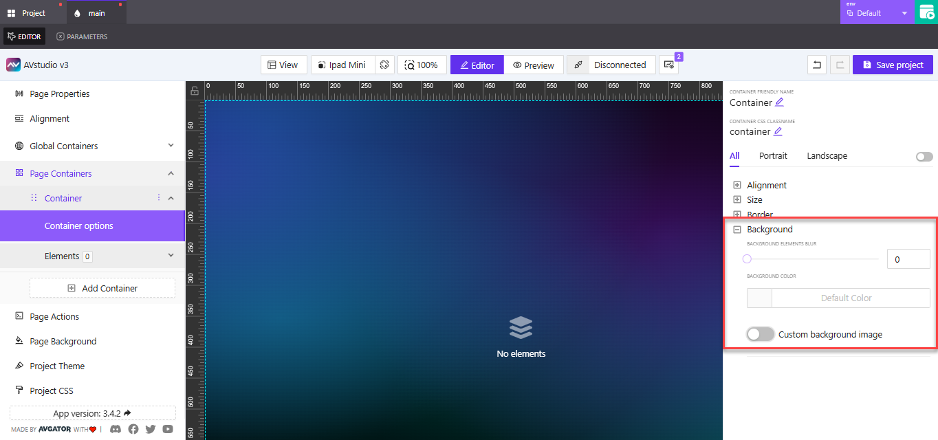
Default Options
When no background image is set, you can style your container using these options:
-
Background Elements Blur
Apply a blur effect behind the content inside the container. This softens visuals and creates a sense of layering. -
Background Color
Click the square preview to open a color palette, or manually type a color value (e.g.,#F3F3F3orrgba(0,0,0,0.5)). -
Toggle Custom Background Image
Use this switch to enable advanced image settings. Turning this on allows you to insert an image from your media library or a URL.
Example: Use a soft gray background (#F5F5F5) with a slight blur to visually separate form sections from the main canvas.
Custom Background Image
When custom image mode is enabled, you can display background visuals that support either branding, content reinforcement, or purely aesthetic design.
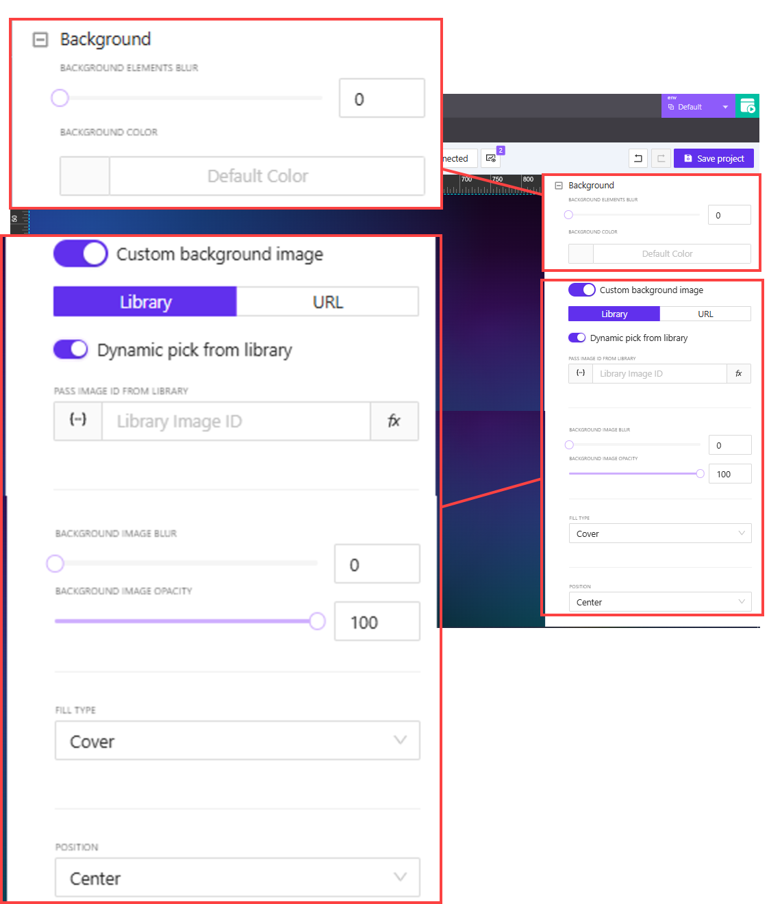
Image Source
You can select an image in two main ways:
-
Library
- Pick a static image from your project's media library
- Or toggle
Dynamic pick from libraryto assign an image ID dynamically - Assign values via a variable, parameter, or state entry
-
URL
- Enter a direct link to an external image
- Or assign a dynamic value through a variable, parameter, or state
Example: Use dynamic image loading for personalized dashboards or live content previews.
Styling Options
After selecting your image, you'll see additional layout styling options:
-
Blur & Opacity
Adjust these using sliders to fade or soften the background image. -
Fill Type
Cover: Fill the entire container while maintaining aspect ratioContain: Scale the image to fit within the container without croppingFill: Stretch the image to fill both width and height (may distort)Custom Size: Enter specific width and height
-
Custom Size
- Set the background’s width and height in
%orpx - Supports dynamic assignment via variable, parameter, or state
- Set the background’s width and height in
Example: Use Cover for full-bleed background images or Contain for logos or branding marks.
- Position
- Controls how the background image is placed inside the container
- Options:
Center,Top,Bottom,Left,Right
Example: Center a logo, or align decorative accents to the bottom corner of the container.
Use Custom Size with Position to fine-tune image placement for responsive design. This is especially helpful for overlapping content or fixed layout structures.