Border Settings in Container Options
The Border section allows you to define how the edges of a container appear. You can keep the project’s default styling or override it with custom width, style, color, and radius settings.
Border styling is useful for visually separating sections, grouping related elements, or adding aesthetic depth to your UI.
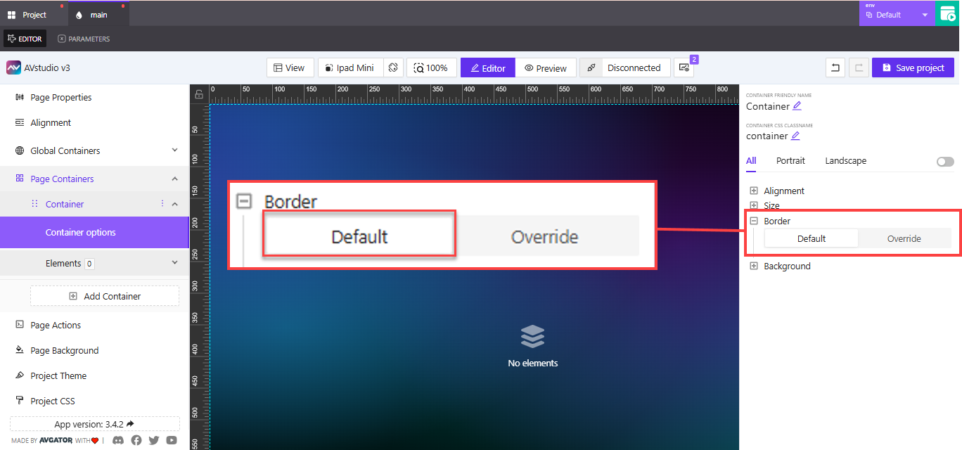
Default vs Override
- Default: Inherits global or theme-defined border settings. You don't need to configure anything manually.
- Override: Opens a full panel where you can customize the container’s border on all sides.
Choose Override when you need the container to stand out or match a unique section style.
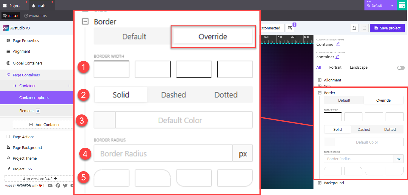
Override Options
1. Border Width (Top, Right, Bottom, Left)
You can apply different widths to each side of the container independently. Enter values in px.
Example: Apply a 2px top border and 0px on other sides for a visual divider above a section.
2. Border Style
Choose how the border line is rendered:
Solid: Continuous line (default and most commonly used)Dashed: Segmented lineDotted: Small round dots
Example: Use dotted for separator containers in forms or footers to create visual softness.
3. Border Color
You can define the color in two ways:
- Type the color code manually (e.g.,
#CCCCCC,rgba(255,255,255,0.5)) - Use the color picker by clicking the square to open a full palette
Example: Match your brand's accent color or use semi-transparent borders for layered UI designs.
4. Border Radius
This controls how rounded the corners are. You can:
- Set a uniform radius (e.g.,
8pxon all corners) - Expand advanced radius settings to set per-corner values:
- Top-left
- Top-right
- Bottom-left
- Bottom-right
Example: Use rounded corners (16px) on card containers to create softer and more modern UI blocks.
Rounded borders are helpful for establishing visual hierarchy, softening boxed layouts, or highlighting grouped content like modals or input blocks.