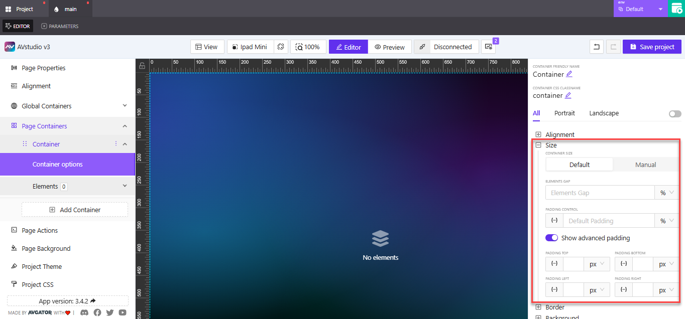
Size Settings in Container Options
The Size section controls how much space the container uses on the page and how spacing behaves inside it. This is where you manage layout structure using either Default or Manual sizing, along with element spacing and padding.
Whether you're building a responsive layout or need pixel-precise control, the size settings help you define spacing that adapts—or locks in place—based on your needs.
Default Mode
The Default mode offers flexible sizing that adapts to content and layout context. It’s the recommended choice when building responsive pages or working with dynamic content that may vary in size.
Elements Gap
This setting defines the space between child elements inside the container.
- You can enter values in
%orpx - Applies consistent spacing between each item
Example: Use a 24px gap between navigation buttons or a 5% gap between cards in a responsive grid.
Padding Control
Padding adds internal space between the container’s edge and its contents.
You can define padding in two ways:
- Fixed values: Type a specific number using common units like
px,em,vh, orvw - Dynamic values: Click the dynamic icon (fx) to bind padding to a:
- Variable
- Parameter (custom value with type)
- State entry (tied to UI behavior)
Example: Assign a padding of 32px for larger screens, or bind it to a containerPadding parameter for layout flexibility across breakpoints.
Show Advanced Padding
Enable this toggle to specify padding per side:
- Top
- Right
- Bottom
- Left
Each field supports both fixed and dynamic values.
Example: Use 0 for top/bottom padding but 16px for left/right to align text with nearby UI elements.
Manual Mode
Switching to Manual allows you to set the container’s actual size.
- Manually enter
WidthandHeightusing%orpx - Retains all other settings from Default mode (Elements Gap, Padding Control, Advanced Padding)
This is ideal for fixed layout zones or design systems where precise alignment is required.
Example: Set width to 300px for a sidebar container or 100% for a full-width banner block.
Use Default mode for adaptive, fluid layouts that respond to screen size. Use Manual mode when your design needs exact dimensions that don’t change based on content.