Alignment Settings in Container Options
The Alignment settings within the Container Options panel control how elements inside a container are arranged and aligned. This section applies to both responsive and adaptive pages and is especially useful for designing flexible layouts that adapt to various screen sizes and orientations.
Whether you're building a form, a button row, or a group of status indicators, aligning and distributing elements correctly helps maintain structure and visual clarity.
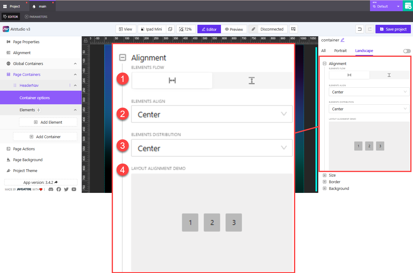
1. Elements Flow
This setting defines the direction in which elements inside the container are laid out.
- Horizontal: Elements appear next to each other in a row (left to right or right to left)
- Vertical: Elements appear stacked on top of one another in a column
Choosing the right flow is essential for defining the base structure of your layout.
2. Elements Align
This controls how elements are aligned along the cross-axis—which is the opposite of the selected flow direction:
Start: Align items to the beginning edge of the containerEnd: Align items to the opposite edgeCenter: Align all items to the centerStretch: Expand items to fill the available space across the cross-axis
This setting helps control vertical alignment in horizontal layouts or horizontal alignment in vertical layouts.
3. Elements Distribution
This setting manages spacing along the main axis—the same direction as the container flow. It determines how items are spread out within the container.
Start: Group all elements at the beginningEnd: Group all elements at the endCenter: Center the group of items as a blockBetween: Distribute items with equal spacing between themAround: Distribute items with equal spacing before, between, and after each item
This is particularly useful when you want to space buttons evenly or structure items symmetrically.
4. Layout Alignment Demo
This preview box provides a real-time visualization of your current alignment and distribution settings. As you update dropdowns or toggle between flow directions, the demo refreshes to show what the changes will look like.
Use the demo box to experiment with layout settings before applying them to your live components—it’s a helpful sandbox for visual planning.