Container Options
The Container options panel allows you to configure how a specific container behaves and appears on the page. Whether you're adjusting layout or applying styles, this panel gives you precise control over container properties.
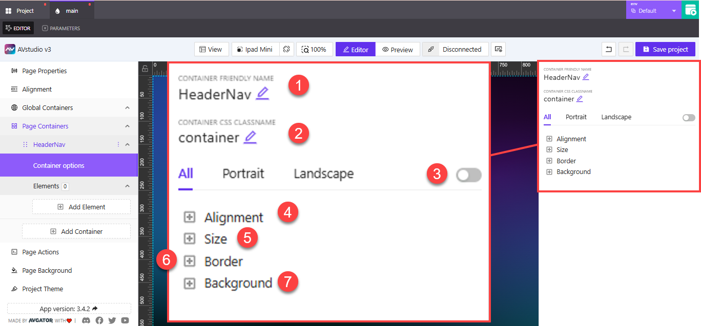
1. Container Friendly Name
This is the display name used to identify the container within the editor. Give it a clear and descriptive name to make your layout easier to manage.
Example: HeaderNav, SidebarPanel, ContentGroup
2. Container CSS Classname
You can assign a CSS class to the container for styling purposes. This is helpful if you plan to apply custom CSS rules across multiple containers or use consistent class-based theming.
3. Layout Toggle by Orientation
This switch allows you to apply layout configurations per device orientation:
- Toggle between
All,Portrait, andLandscape - If disabled, settings apply uniformly regardless of orientation
4. Alignment
Expands to show alignment options for the container. You can control horizontal and vertical alignment relative to the parent or page layout.
5. Size
Lets you define the container's width and height, either in fixed values or percentages depending on layout needs.
6. Border
Customize the container’s border with:
- Thickness
- Color
- Radius (for rounded corners)
7. Background
Configure the background color or image used in the container. You can choose solid colors, gradients, or upload assets.
These container-level settings help you tailor each layout block’s appearance and behavior—especially when working with shared components or responsive positioning.
When using multiple containers with similar roles (e.g., section headers), reuse class names and align settings to maintain consistency across your project.