Containers
In AVstudio, containers define the structure of your interface. They hold elements, apply styling, and help organize how content is displayed. This article introduces the two main types: Global Containers and Page Containers, and explains how they behave on both responsive and adaptive pages.
Global Containers
Global containers are layout blocks that can be reused across multiple pages. They are ideal for creating persistent UI sections such as headers, footers, or navigation bars.
Global containers are also referred to as global elements in some areas of the interface. Creating them ensures consistency across pages and reduces duplication.
Page Containers
Page containers exist within a specific page and provide the main structure for placing elements and organizing content. Their behavior changes depending on whether the page uses a responsive or adaptive layout.
Responsive pages
In a responsive AVstudio page, the Page Containers panel helps you organize and manage layout structure. This section explains what each part of the panel does and how to interact with it.
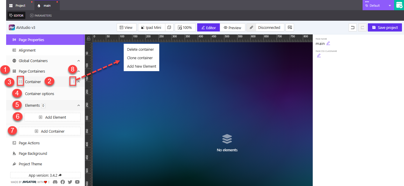
1. Page Containers Tab
Click Page Containers to expand the section. This reveals all containers currently in use on the page, along with options to configure or add more.
2. Container Block
Each individual container in your layout is represented here. By default, it’s labeled Container, but you can rename it to match your layout needs.
Containers are used to group related elements and define structural sections on the page, such as headers, content blocks, or footers.
3. Drag Handle (Six Dots)
The six-dot icon allows you to click and drag the container to reposition it within the page layout. This is helpful when reordering containers without deleting or recreating them.
The drag handle is available in both responsive and adaptive pages, but adding containers is limited to responsive layouts.
4. Container Options
Click to expand Container options, where you can define layout-specific settings. This section determines how the container behaves within the overall layout.
5. Elements Section
Displays how many elements are currently inside the container. You can click this to expand the section and view individual elements for editing or rearranging.
6. Add Element
Click Add Element to insert a new item into the container. You’ll be prompted to enter a name and select an element type, such as a button, label, or image.
7. Add Container
Responsive pages support multiple containers. Click Add Container to create a new one, then use it to organize new layout blocks or separate components visually.
8. Vertical Menu (Three Dots)
This icon opens a dropdown menu with the following container actions:
Delete container– Removes the container and its contentsClone container– Creates a duplicate container with the same structure and settingsAdd New Element– A quick shortcut to add a new element to this container
Each part of this panel works together to give you granular control over your layout. You can rearrange containers, insert new components, and configure behavior—all within the Page Containers section.
Adaptive pages
In an adaptive AVstudio page, the Page Containers section gives you access to static elements, which behave differently from the flexible containers in responsive pages. Here's a breakdown of each labeled area in the interface.
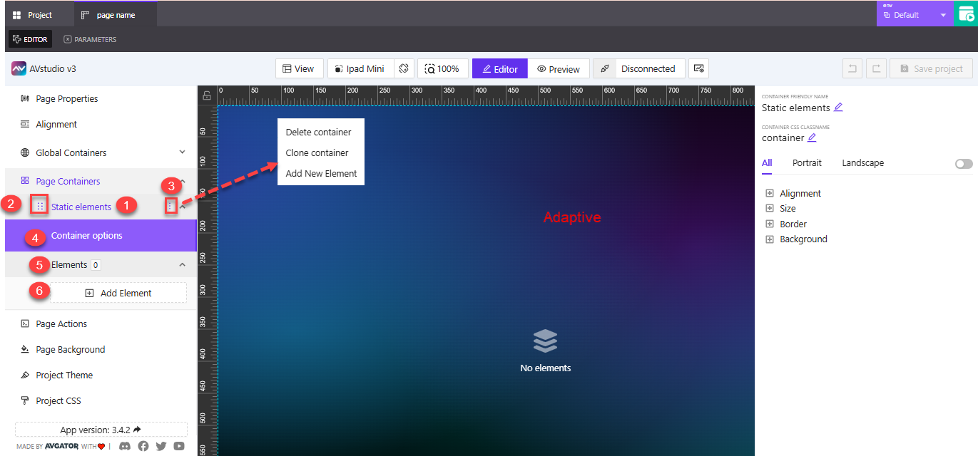
1. Static Elements
This is the container used in adaptive pages. Instead of dynamic containers, adaptive layouts rely on Static elements to build fixed, screen-specific structures.
Static elements are still configurable and editable, but they don’t allow adding multiple containers from this panel.
2. Drag Handle (Six Dots)
Click and drag the six-dot handle to move the static element up or down in the layout. This makes it easy to reorder blocks visually without deleting or duplicating them.
The drag handle is available in both adaptive and responsive pages. It’s especially useful when fine-tuning fixed layouts.
3. Vertical Menu (Three Dots)
Click the three-dot menu next to the element name to reveal quick actions:
Delete containerClone containerAdd New Element
These options let you duplicate a layout block, insert new elements, or remove unused structures.
4. Container Options
This section opens a configuration panel for layout-specific settings, including:
AlignmentrulesSizecontrolsBordercustomizationBackgroundstyling
Settings in this panel apply only to the selected static element.
5. Elements Section
Displays the number of elements inside the static element. You can click to expand and manage these individually.
6. Add Element
Click Add Element to create a new UI component inside the static element. You’ll be prompted to name the element and select its type.
Unlike responsive layouts, adaptive pages do not allow creating additional containers from this panel. You work with one static structure per layout, focusing on pixel-specific positioning and screen fidelity.
Adaptive layouts are ideal when you need precise control over how each element appears at a fixed resolution—such as kiosks, control panels, or embedded systems.